LIFTING THE SPIRITS OF THE GARAGE LIFT
Italy’s Garage Equipment leader Ravaglioli is one of Europe’s main players in the production of garage lifts. Within the larger framework of evolving the company’s brand identity, they decided to give their two-post lifts range a complete overhaul from a design point of view, with the help of Studio Volpi. The Studio’s ability to merge its mechanical and engineering competencies with the creativity and vision of its designers made for an inspiring project, with amazing results.
Showing one's true colours
Visual Brand Language, i.e. the aesthetic features that make your products immediately recognisable, is an important part of a company’s product communication. Not only will it reassure customers about the consistency of your entire range, but it will also and foremost speak tons about your brand values, helping establish, in the best possible way, that elusive yet fundamental connection with your target audience. In the case of Ravaglioli’s new lift, Studio Volpi’s task was precisely to create the visual features, in other words the actual design of the product, that would effectively communicate the newly defined set of company values and convey that sense of family, in line with the new brand identity created for Ravaglioli.
The value of words: what it takes to be a leading lift
The Studio first started working on identifying a series of brand and product keywords that would best describe the values needing to be expressed at all levels of communication. In turn, these key values would be turned into attributes to create the right design language, starting from the present status and, albeit limited, current signature design elements.
The key values identified were. Reliability; Durability; Robustness; Performance; Power, and Heritage. Each of these would spark the research for some defining aesthetic attributes characterising them. For instance, “Power” would translate visually into broken lines, which could be further subdivided into accelerating lines, non-continuous surfaces, sharp edges and chamfers. Heritage and brand equity would best be communicated through a strong family feeling and an immediately recognisable and unique design, one that would make the product stand out.
A solid base to build upon
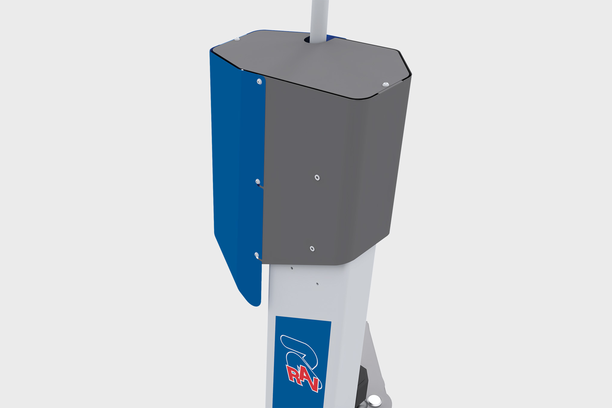
The current visual elements characterising existing Ravaglioli products did provide some useful input to start building the new look of the product in question, which would then extend to all future products in the range. One of the brand’s most recognisable features was its traditional bright blue colour. Possibly not the best choice to convey a strong sense of professionalism. This was one of the elements that the Studio concentrated on when developing the new design.
This first stage was also characterised by an in-depth review of the main players and competitors in the industry, to establish a benchmark on one hand and, on the other hand to clearly differentiate the product and make it stand out from the crowd.
Also, trends in the industry and outside the industry were considered and carefully reviewed, in order to create a design that would be modern and appealing.
Areas of intervention
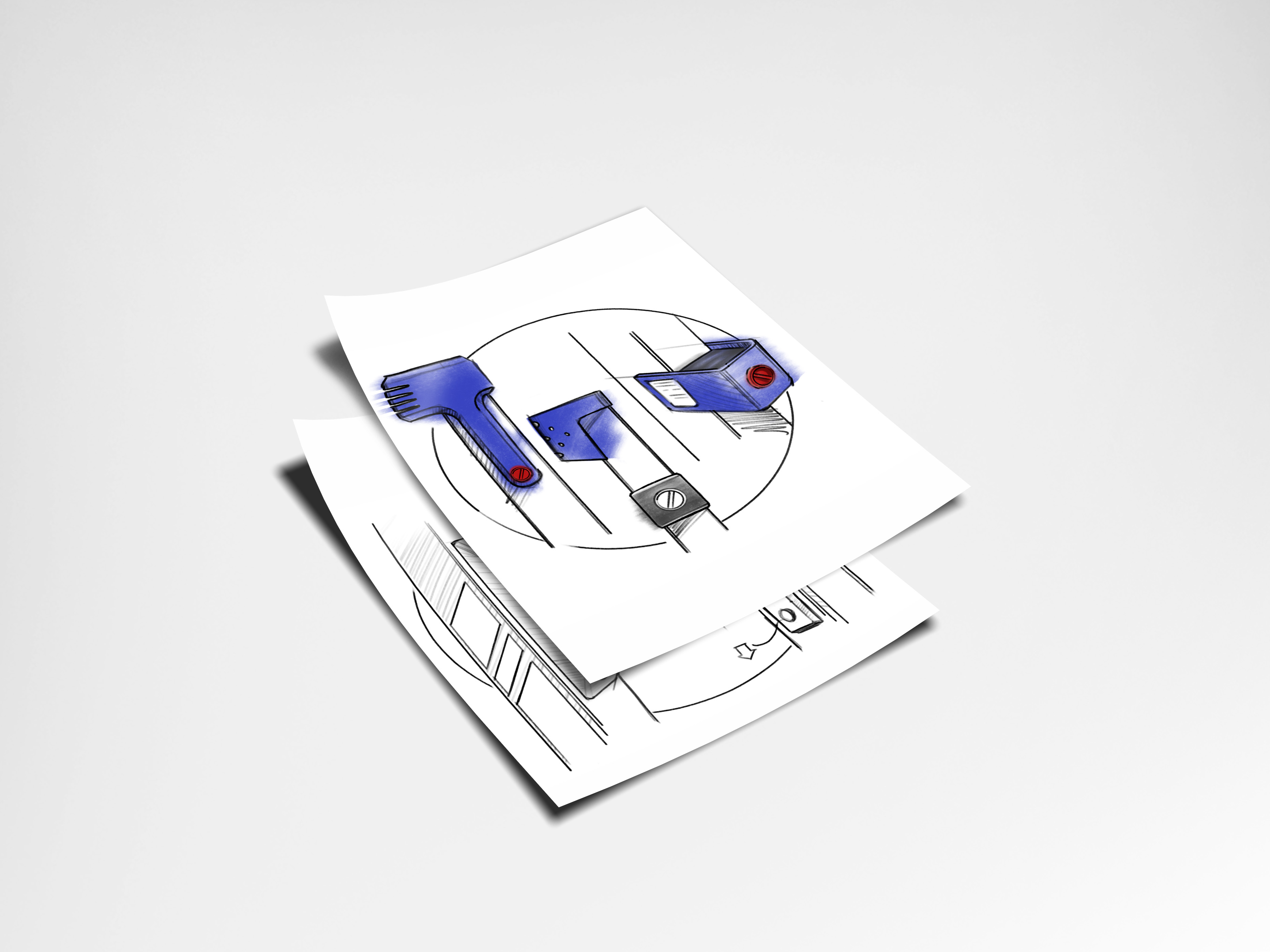
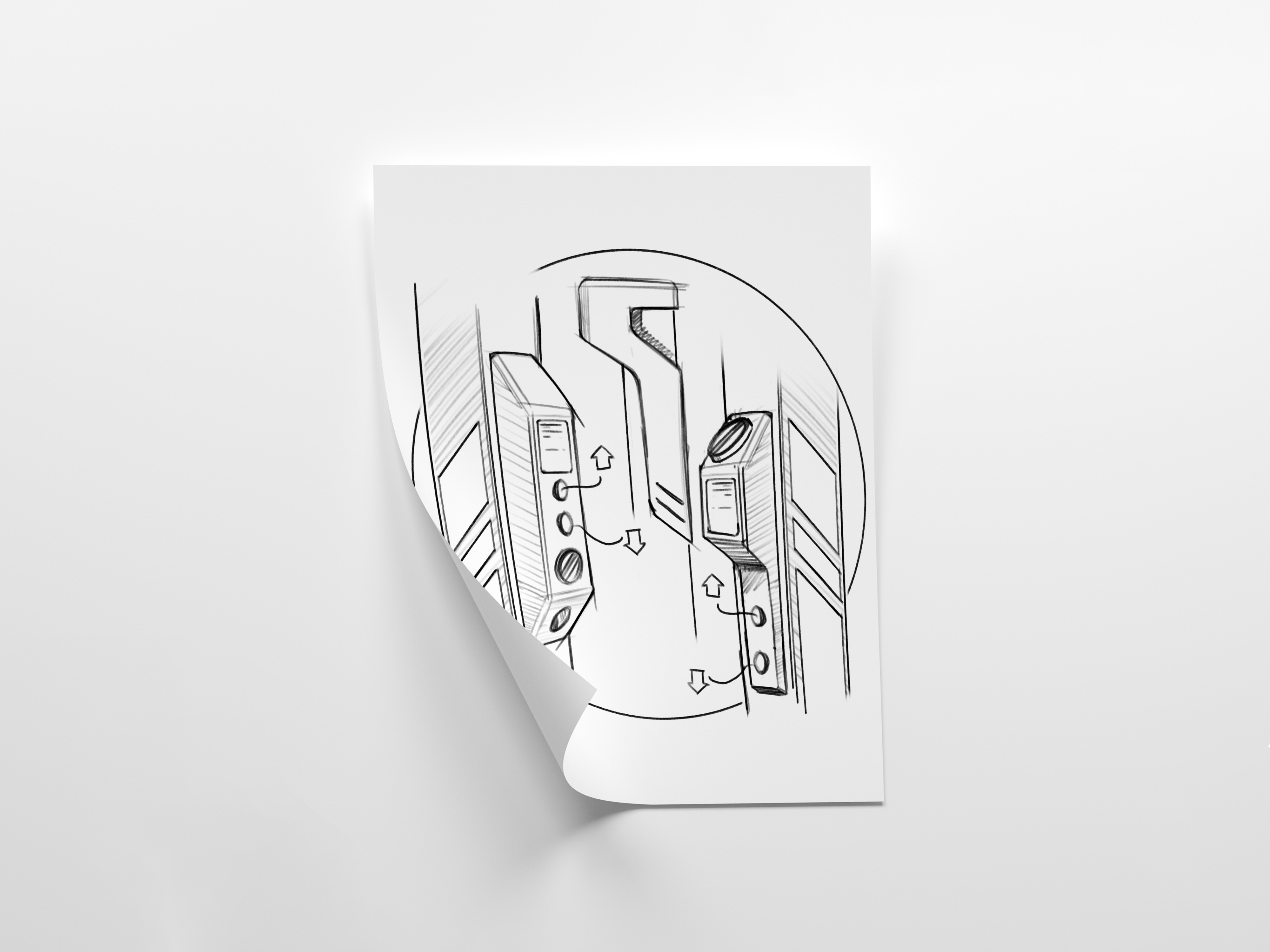
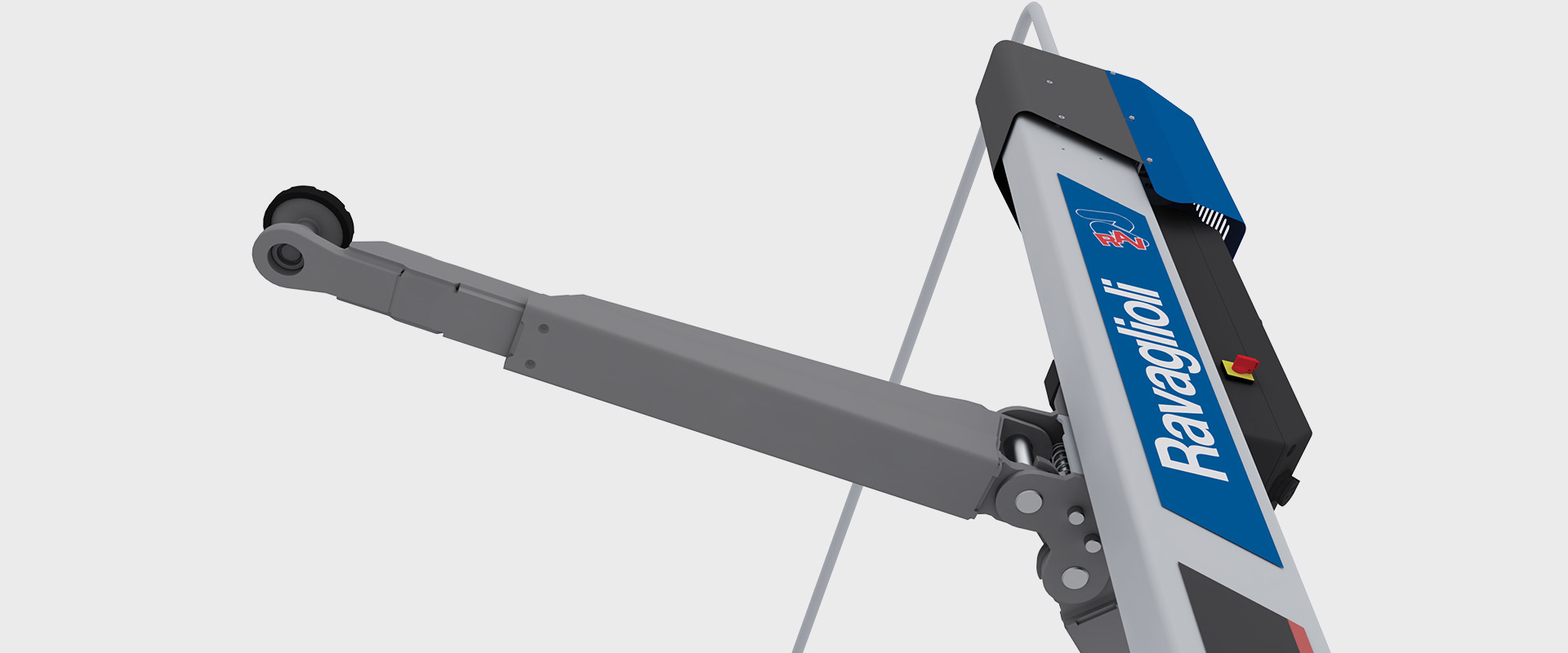
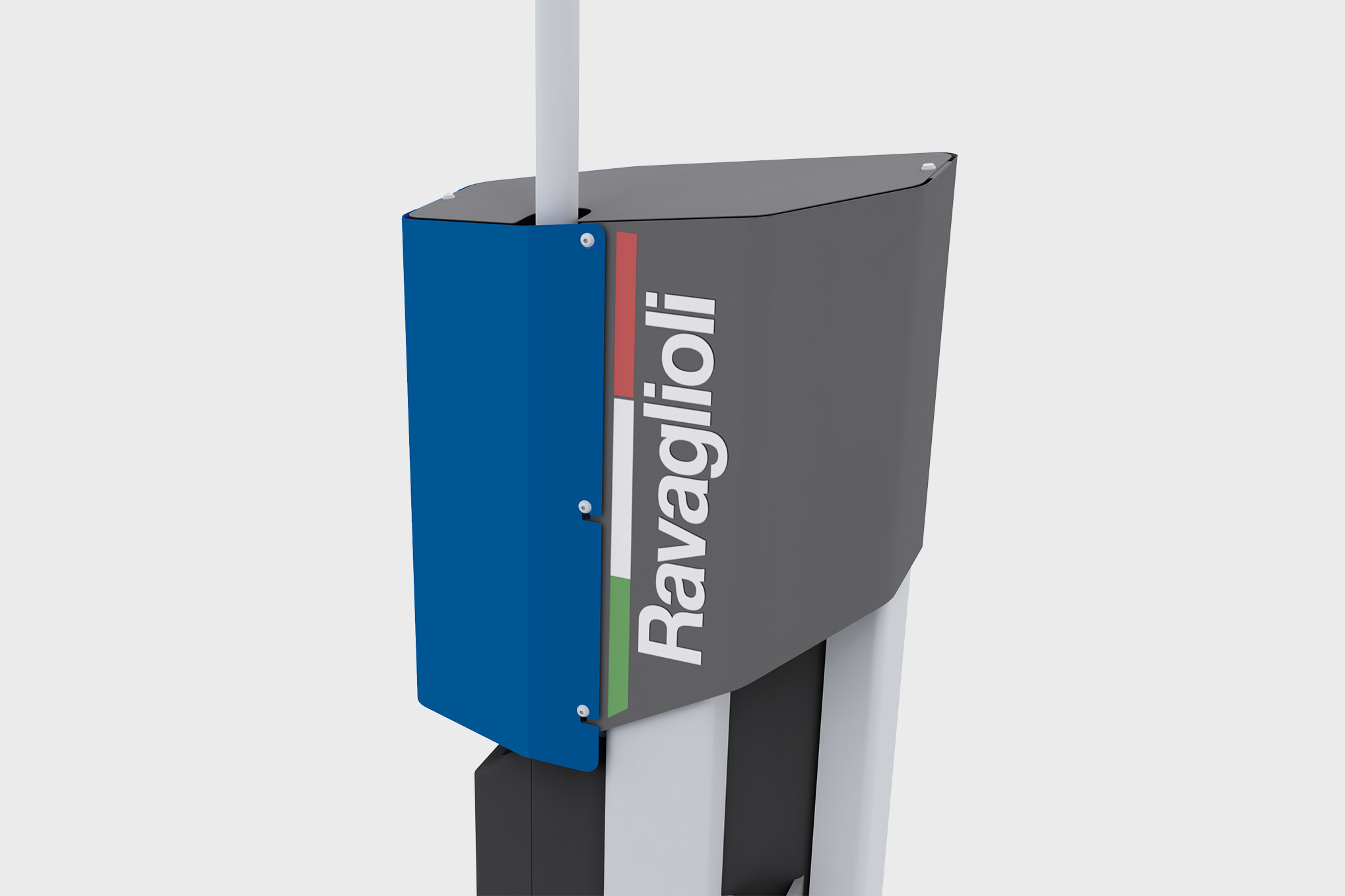
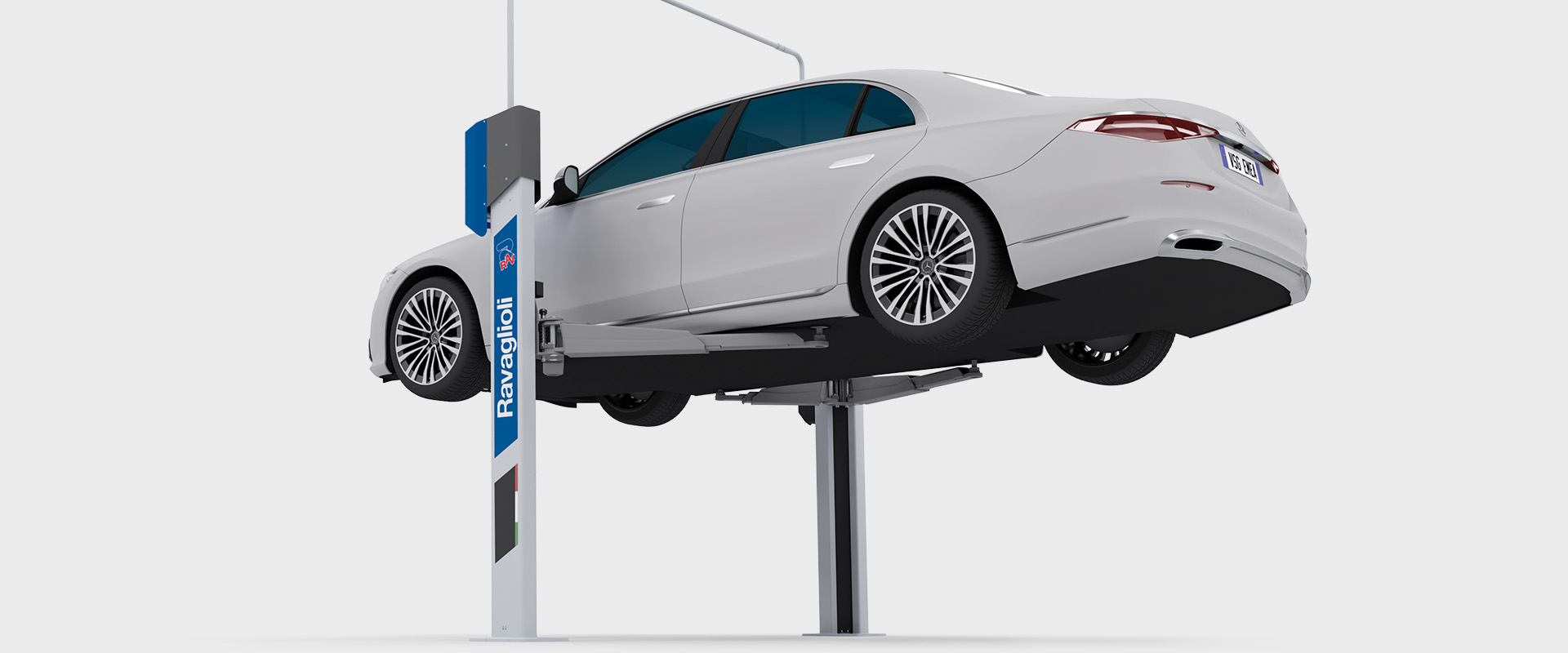
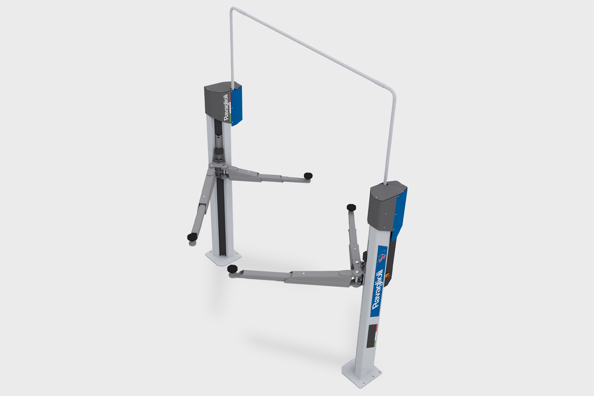
The work of Studio Volpi’s designers mainly concentrated on the most visually meaningful parts of the products, like the carters located at the top of the posts and the electrical panel placed on one of the poles, also representing the main interaction point with the user, yet every part of the product was given due attention. Ergonomics also came into the equation.
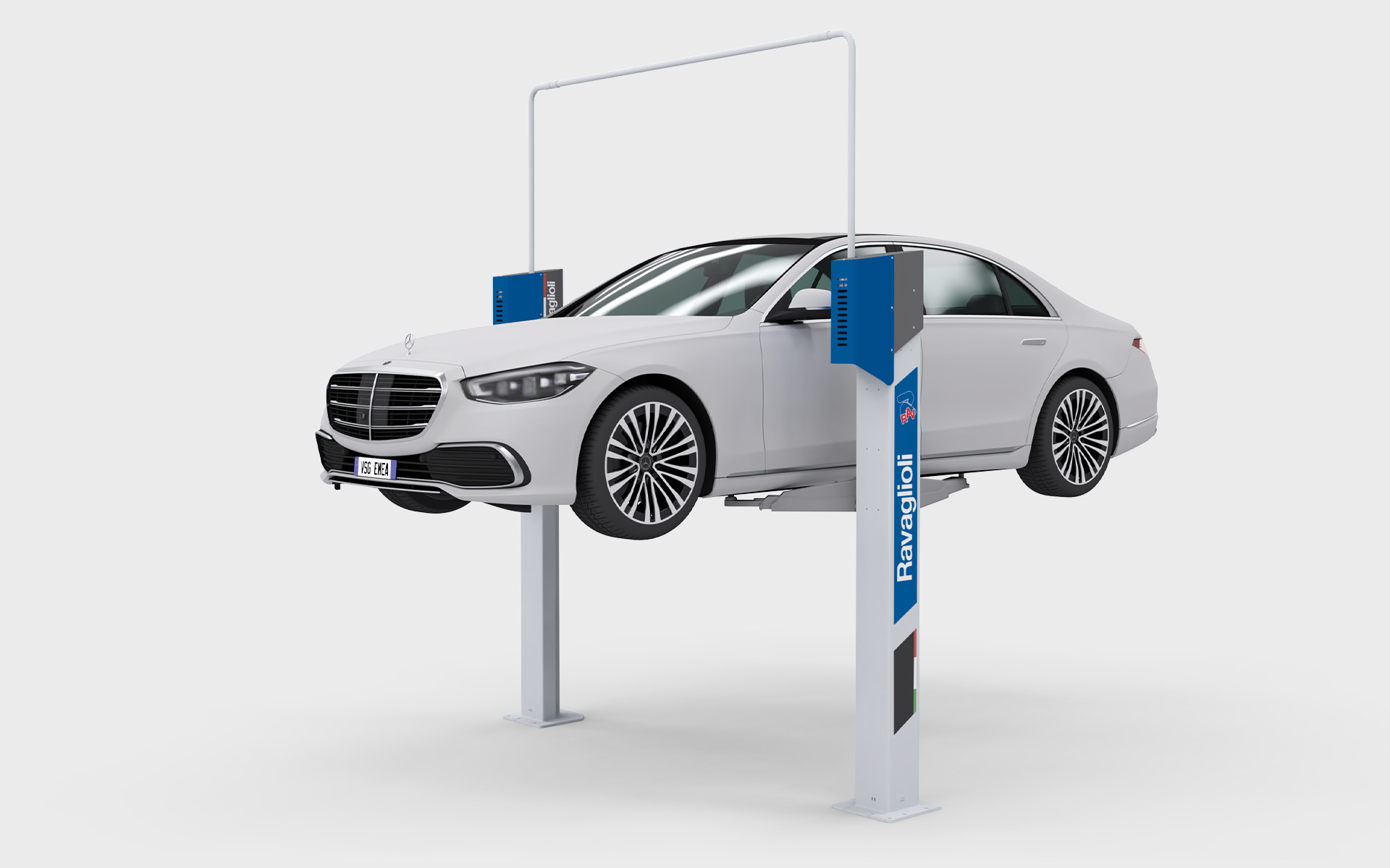
The new signature blue colour can certainly be seen as one of the most distinctive and unique elements throughout the design. Textures and patterns had a role to play, too, as they could enrich some otherwise simple surfaces. Finally, logos and graphics were given careful consideration in terms of design, dimensions and positioning.
The winning concept
Of the 3 proposed design concepts presented as a result of the team’s work, the one that was finally chosen by the client was characterised by a strong feeling of a sturdiness, performance and functionality. The original colour was changed to a new blue colour, darker and deeper than the previous one, so the new products would give off a more modern and professional feel. The new, immediately recognisable two-colour carters at the top of the poles make for perfect signature elements, and the graphics on the poles complete the new design by giving it a distinctive look. The vertical user-interface was conceived following ergonomic rules.
Rounding off with sleek comms
Not only was Studio Volpi able to help Ravaglioli with the design overhaul of its two-post lifts, it also provided them with matching communication materials such as brochures and layouts for the brand’s online channels and other uses. In particular, being in close contact with their colleagues working on the actual products, the Studio’s graphic designers developed engaging, effective layouts for brochure covers and internal pages, based on the work done around brand and product values.
More to come
One of the challenging the Studio’s team had to address during the project was to adapt the design they were working on to the many different versions of the same product, some maybe with mechanical parts placed differently on the machine, or with different positions and dimensions of the control panel. Here again, the expertise and multidisciplinary skills of the team allowed designers to work at close contact with engineers, ensuring quick and effective resolution of any technical issue. The winning design is now being implemented by Ravaglioli, and extended to the whole of the successful new Legend series.