BRAND OVER FORM: bucking the trend with Duracell
Duracell
When the world-known, iconic brand of disposable batteries decided to extend its product range into rechargeable power packs, Studio Volpi was asked to explore possible design choices.
The move was inevitable. As society is becoming ever more environmentally conscious, and at the same time is increasingly dependent on mobile devices, the market for charging solutions has kept on a steady growth path and is not likely to slow down any time soon. It comes to no surprise that Duracell, the undisputed world leader in the disposable batteries industry, decided to diversify into the segment of rechargeable power banks.
Studio Volpi given a blank slate
From a technology, scientific standpoint, Duracell developers knew their subject inside out, of course, but when it came to the look and feel of the new product they decided, wisely, to take a step back. The going trend in the design of power banks, a segment dominated by Asian players, was characterised by mean-looking, sleek and slim devices in shiny metal finishings. Was Duracell to conform to what seemed to be the norm?
In order to form an opinion, they asked Studio Volpi, as an independent design and branding specialist, to explore all the possible design routes, without limitations of any sort in terms of shape and look. Practically a blank slate, with all the time in the world, or nearly. The once-in-a-lifetime, dream job for any designer.
The unwieldy legacy of a universally loved brand
Initially and by all counts, Studio Volpi did an excellent job at trying to force-fit the cumbersome Duracell brand persona into a host of different sleek looking, streamlined shiny little gadgets. Yet, while paying tribute to the current, mainstream design trends, all the solutions seemed to somehow betray the brand when it came to its defining traits of reassuring sturdiness, longer lasting power and total reliability. The conclusion was invariably: this is so “not-Duracell”! Yet they were actually quite pleasing to the eye and had everything it takes to hold their own on the crowded power bank scene. But Duracell, and its bulky personality, were not there to be just another anonymous player.
A bunny to the rescue
Taking the issue from a reverse angle, the Studio then started to work on what precisely “didn’t fit” with the mainstream trends of the segment. To start with, Duracell was a known name, whereas the competition seemed to be made up of anonymous makers positioning themselves according to performance, price point and futuristic design.
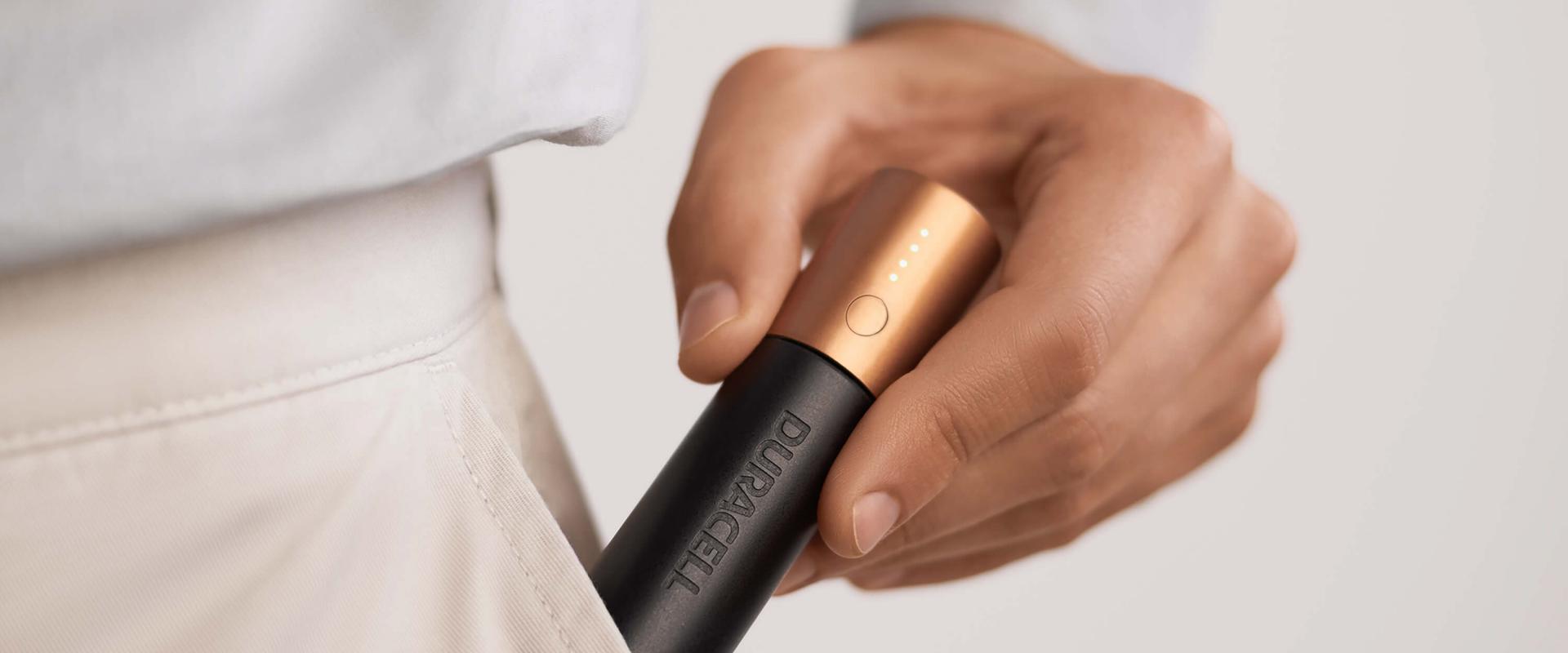
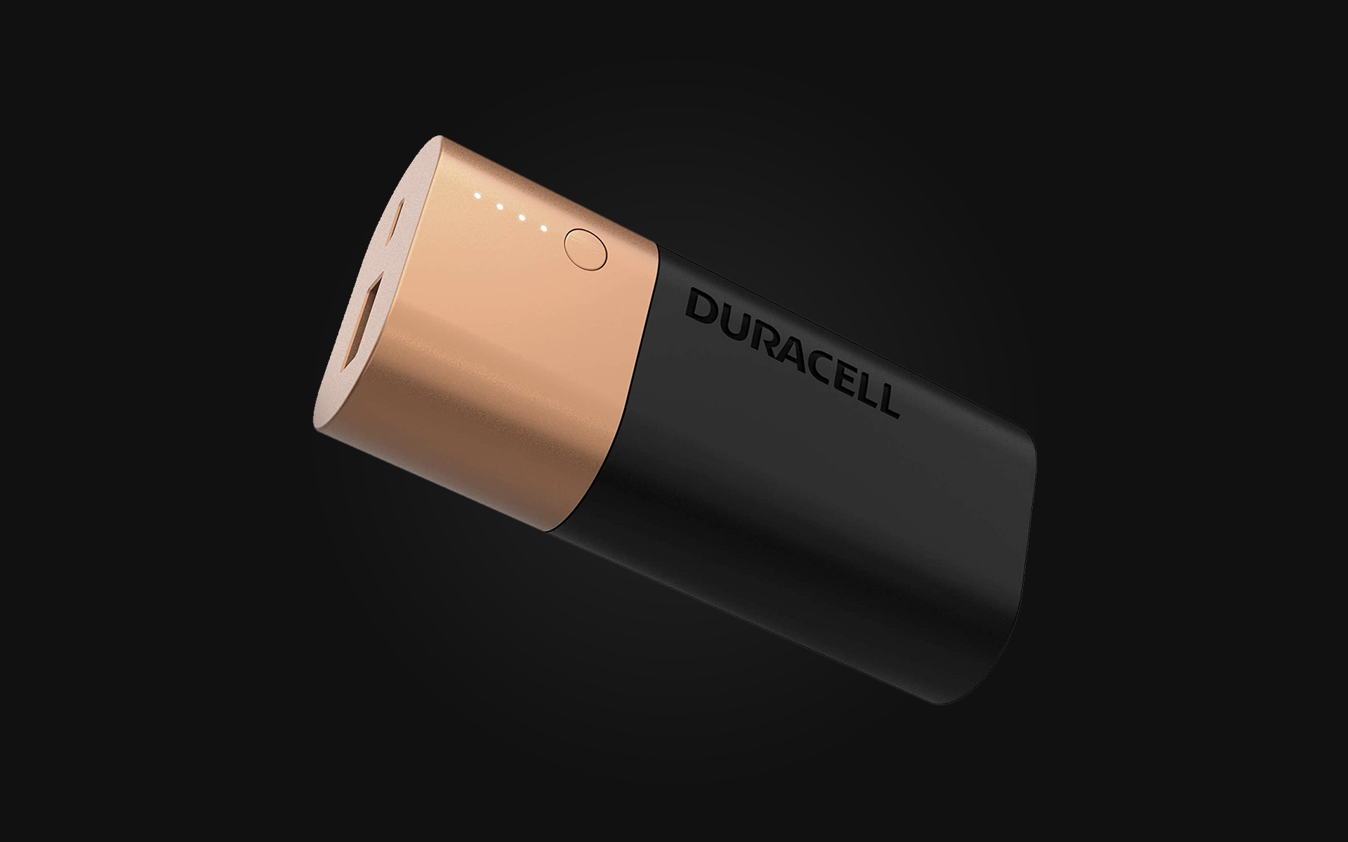
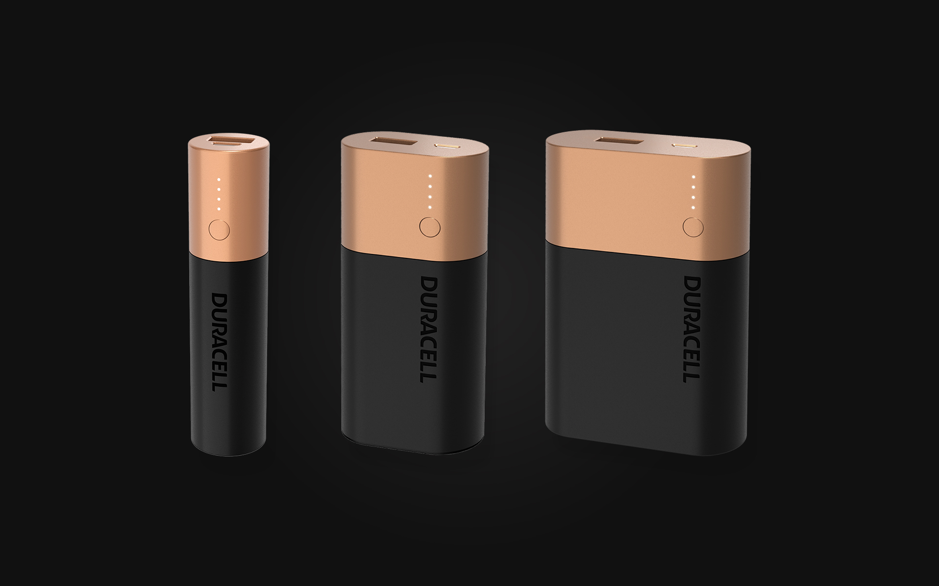
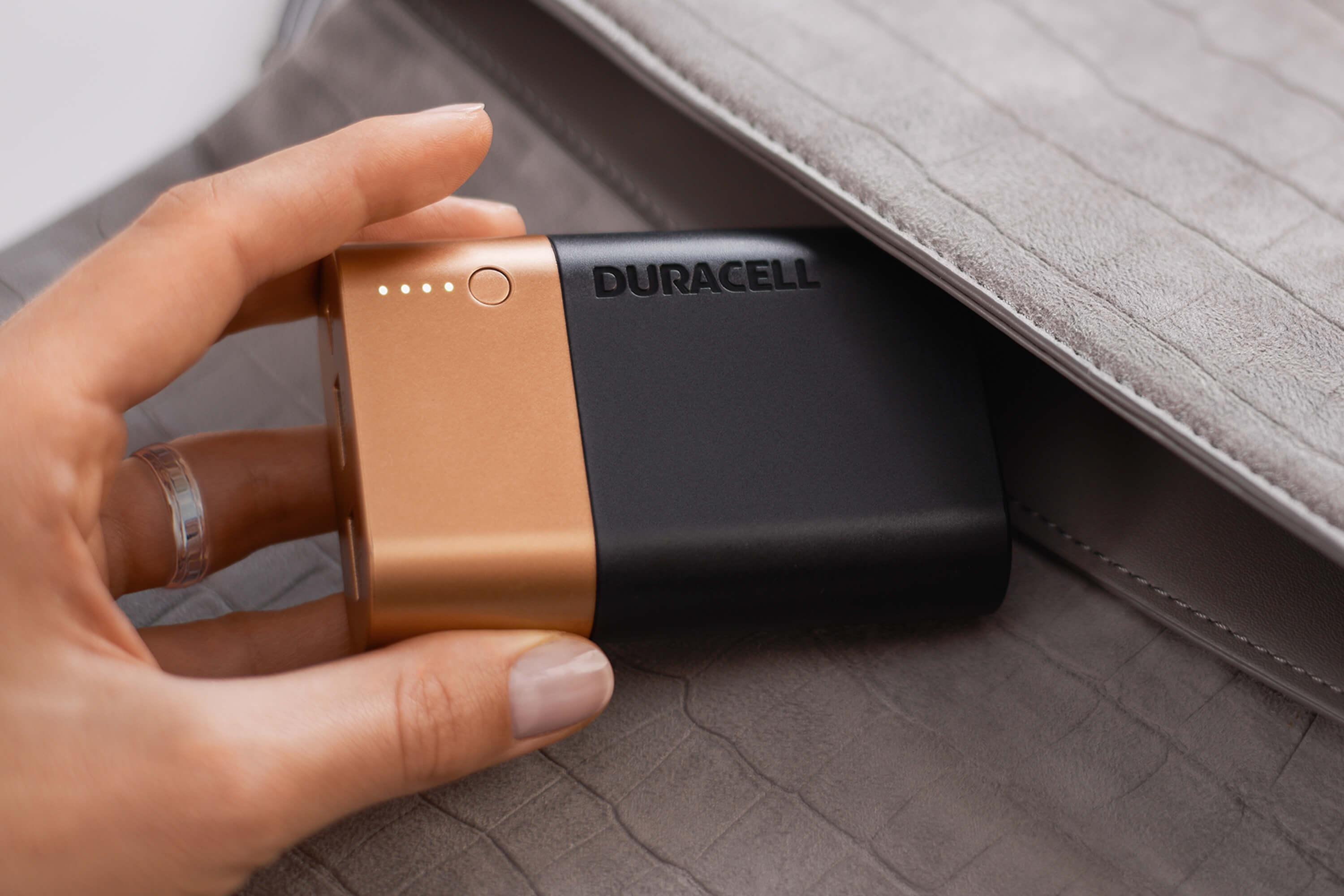
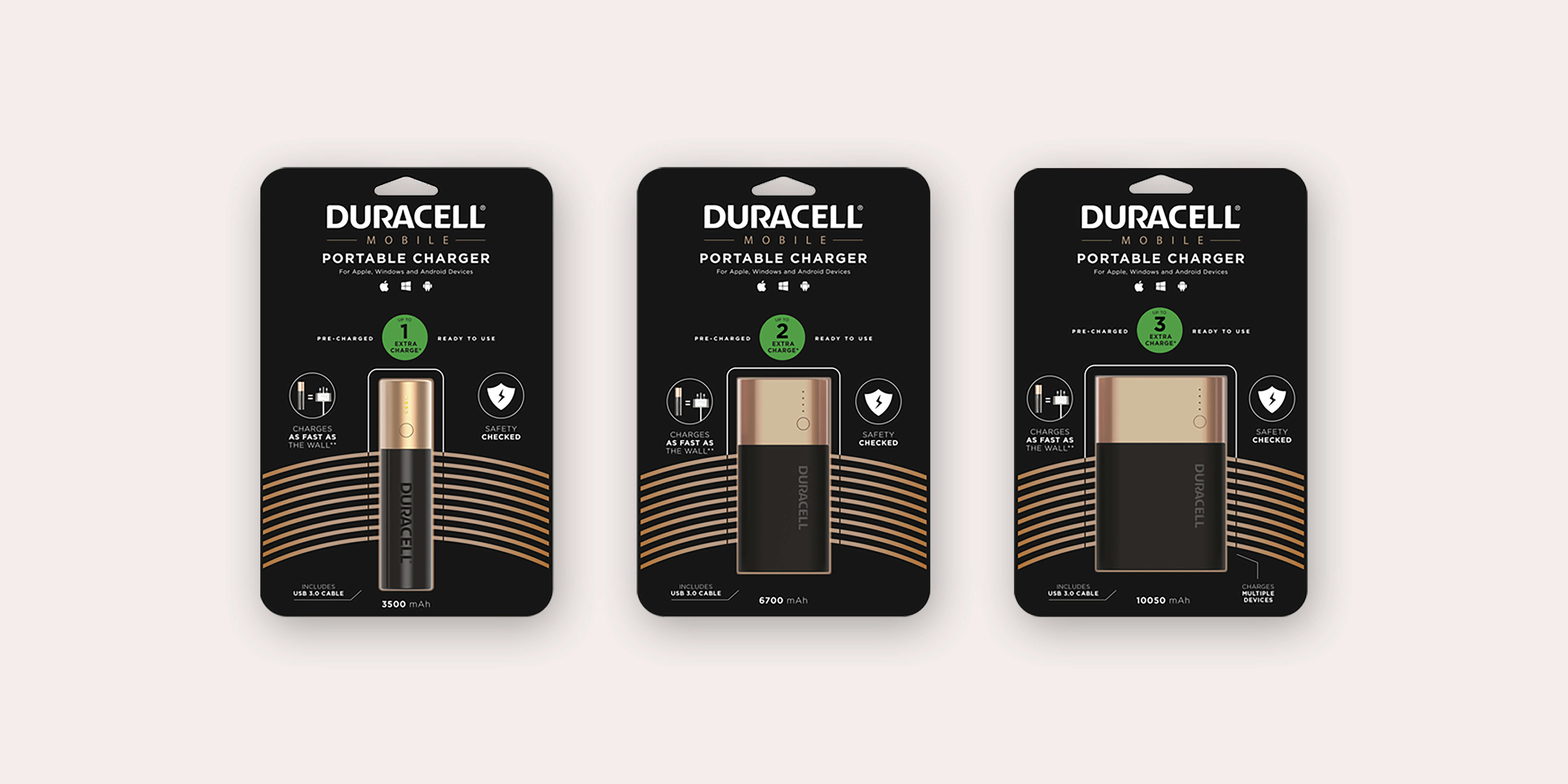
So the name would certainly help the Duracell powerbank to stand-out from the crowd, but to make sure all the benefits attributed to Duracell’s traditional offer would transfer to the new products, these would need to convincingly embody the brand’s iconic visual identity: in other words the black and copper livery, in a two-to-one proportion, and the rounded, battery-like shape.
The visual impact also needed to convey a sense of lasting performance and the idea of a solid, safe object. Really a marketing “coup” over pure design aesthetics.
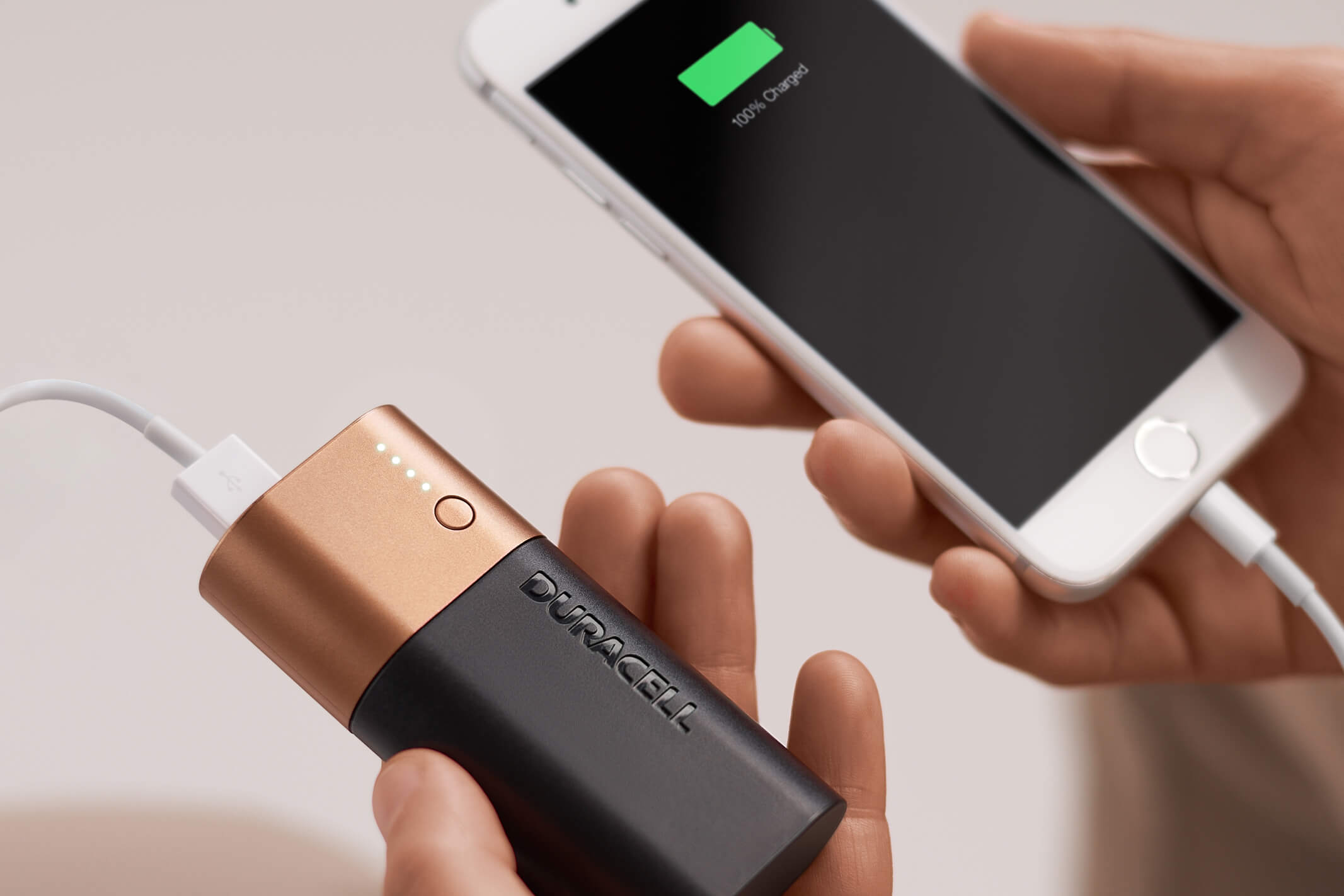
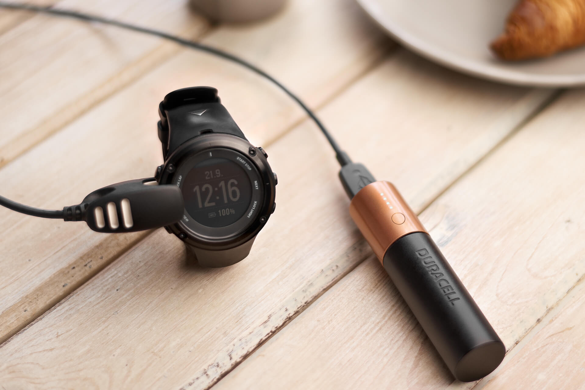
The design, as unconventional as it was, had a lot more to it than simply imitating the looks of a Duracell battery. As many as ten safety features were introduced to avoid over-charge, over-discharge, overheating, short circuit and other issues such as accidental drops and electric shock. It also had features like a well-thought LED display showing status in a clear, easy way, and was deliberately made for carry-on flight approval.
Packaging was also key to reinforcing the sense of “belonging” to the Duracell world. The typical blisters batteries normally come in were a natural choice, even though the Duracell powerbank would be sold mainly through online global retailers. The familiar, reassuring look of the product and its packaging would help consumers transfer their positive predisposition for the brand to the new powerbank. Even the brand’s pink bunny was deployed in the relevant markets, proudly featuring on the front of the package.
Initially, it had three versions of varying capacities and sizes. The range was recently completed with a fast-charging model, competing with the leading cellphone brands’ own high-end products.
It worked
Eric Loiseau, Studio Volpi’s senior creative designer, felt that the project was as much a way for Duracell to come up with the right design for their product as it was a “live-fire” exercise for putting the Studio to the test as a credible, worthy partner.
“I think we did pass the test, since the new Duracell powerbank, which was launched in late 2019, was a global success. They had the courage to go against the grain and stand by their values and their brand identity, and that certainly paid off. This time, it was brand over design. A great lesson in marketing strategy. To date, we are still working with Duracell on new projects.”

As much as it seems that design at large, or at least a certain idea of design, comes out vilified by the Duracell powerbank case, nearly all the online reviews, for instance on Youtube, quite on the contrary vindicate the company’s choice and celebrate the very design of the product as one of its strong points! The fact that its shape and colours are inspired by Duracell’s iconic batteries is rated very positively. The impression of reliability and solidity deriving from its compact, sturdy appearance, commands a higher retail price, as does the Duracell name. Of course performance lives up to the brand’s reputation and contributes to the ongoing success of the powerbank nearly two years on.
“Today the evolution of the powerbank design goes, among other things, towards a more environment-friendly packaging, made of recyclable materials and completely plastic-free.”
After all, the Duracell Powerbank case might prove to be a magnificent example of what design ultimately does and should do: “privileging function while making function look its best” where best is intended not in terms of absolute aesthetics or hype but as most appealing and inspiring for consumers.