Enabling a memorable cooking experience
Angelo Po
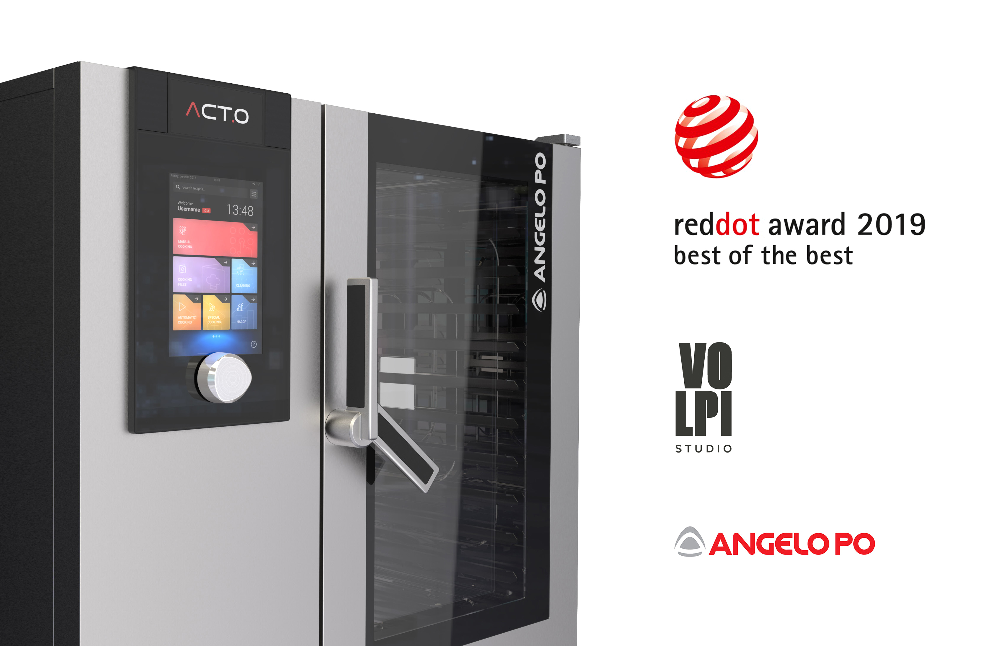
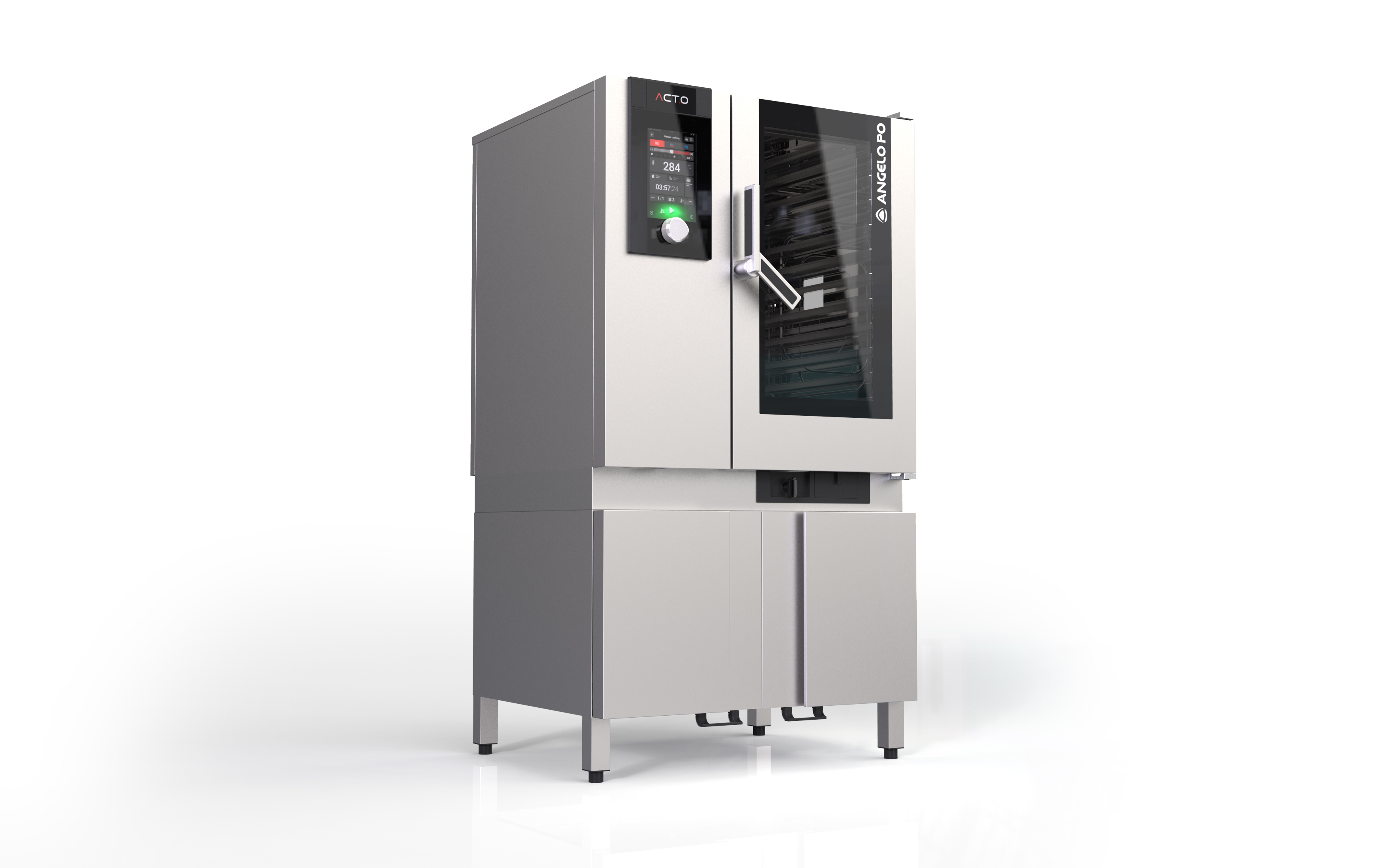
ACT.O professional combi oven
With over 90 years of history, Angelo Po is a worldwide market leader in the design and production of professional kitchen solutions. Their products range from horizontal and vertical cooking lines to food storage systems, delivering superior quality products that grant chefs outstanding cooking performances.
Brief
Angelo Po professional ovens were always considered a benchmark in their market since their first launch ten years ago. The company asked Studio Volpi
to re-design this professional oven keeping into great account the final user experience that, as stated by Angelo Po itself, aims at giving a memorable cooking experience.
Challenge
The goal of the project was to update the design and simplify the interaction of the users with the professional oven, all while keeping a link with the strong iconic elements of the brand.
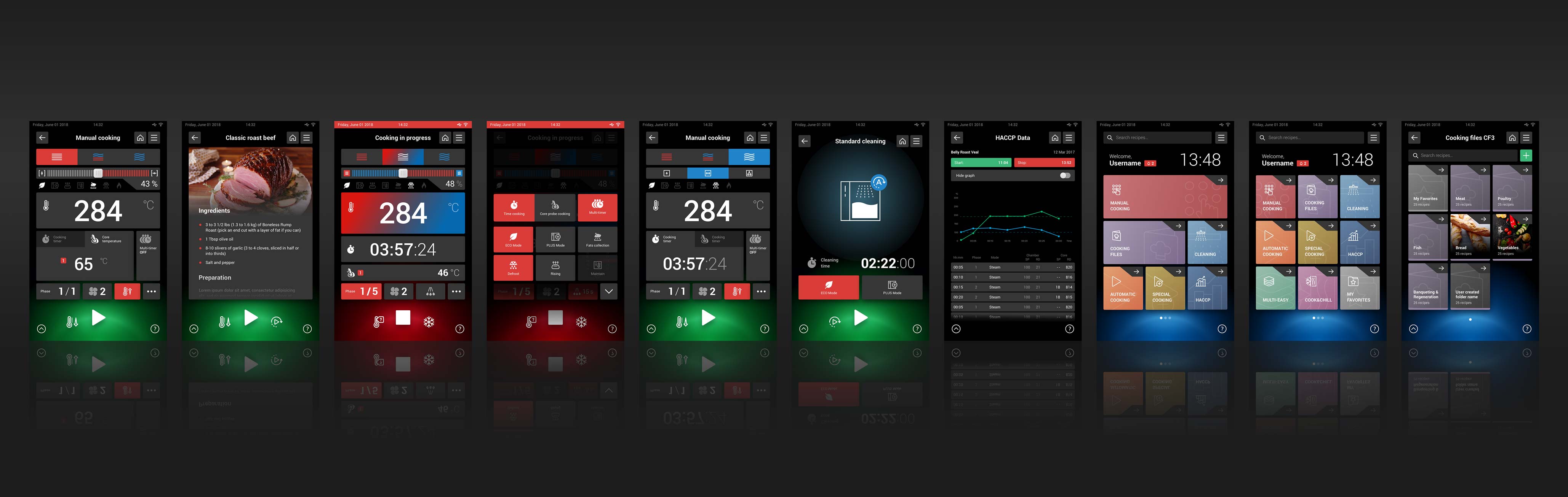
Following a user-centered approach, the UI is now totally customizable to adapt to specific user needs.
Solution
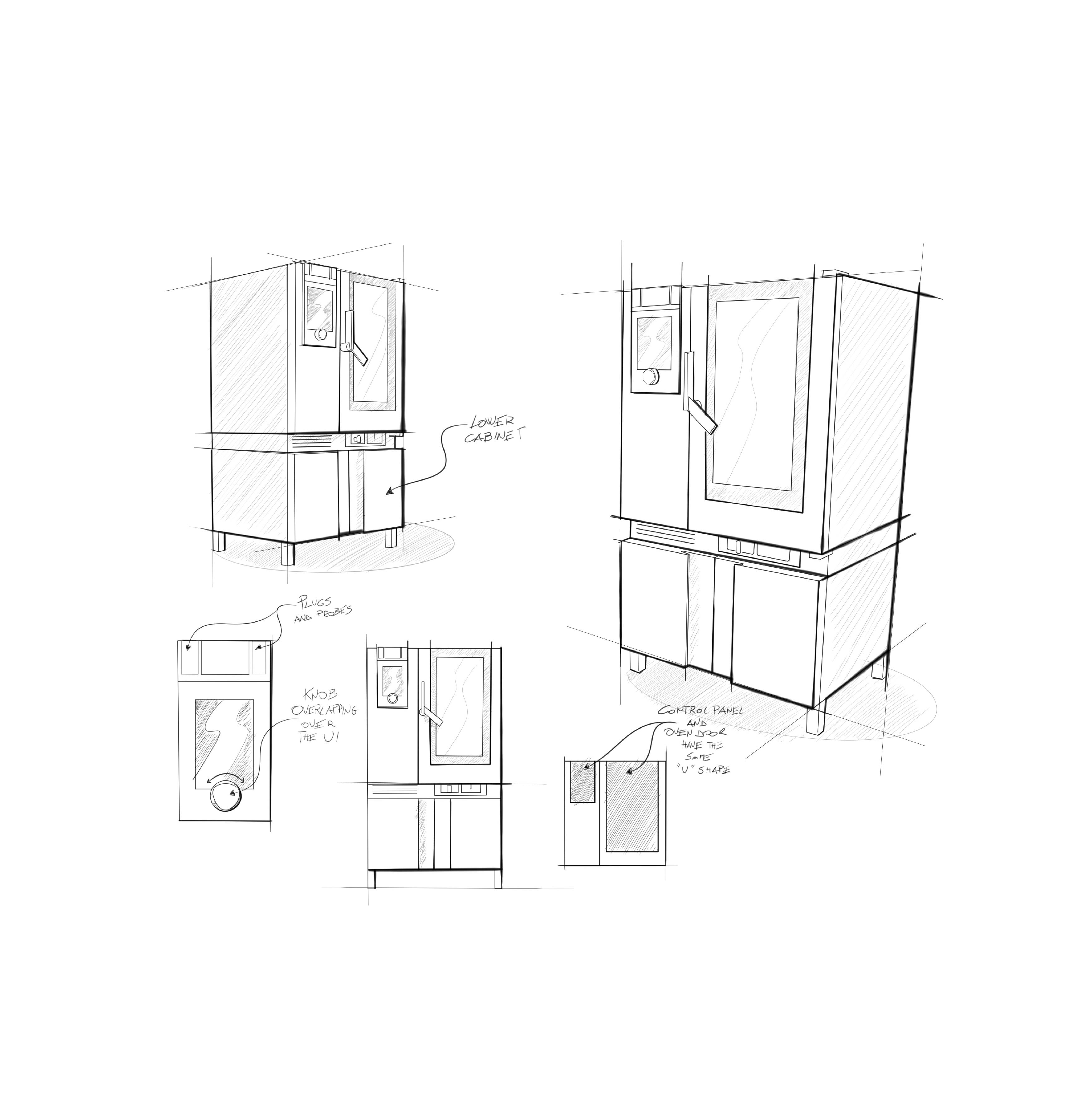
The Studio Volpi design team focused on the identity elements that made the oven’s design iconic:
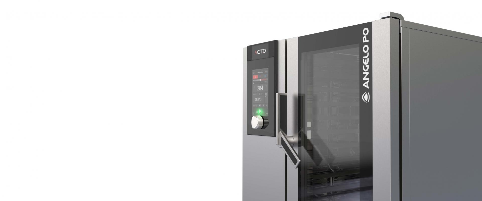
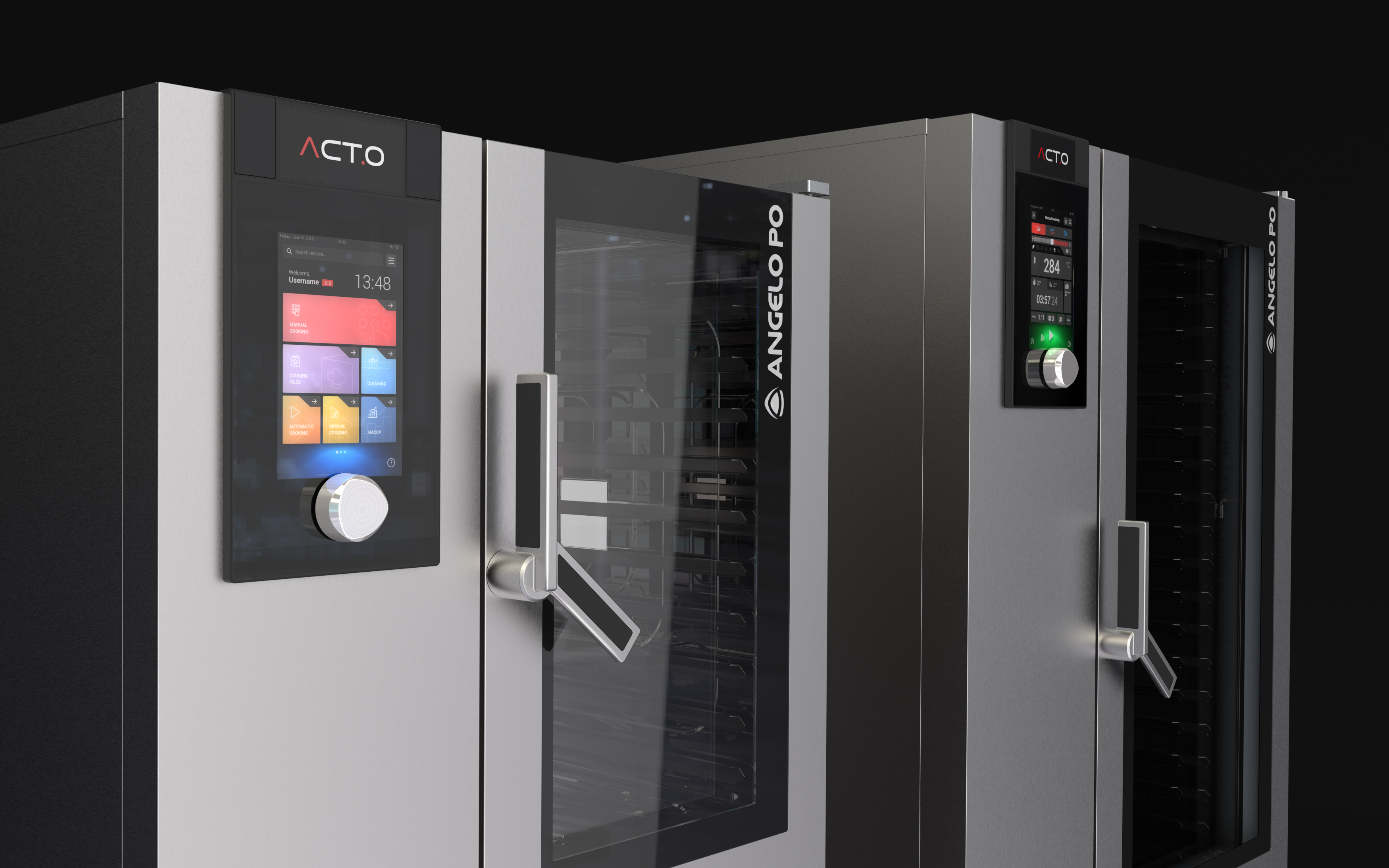
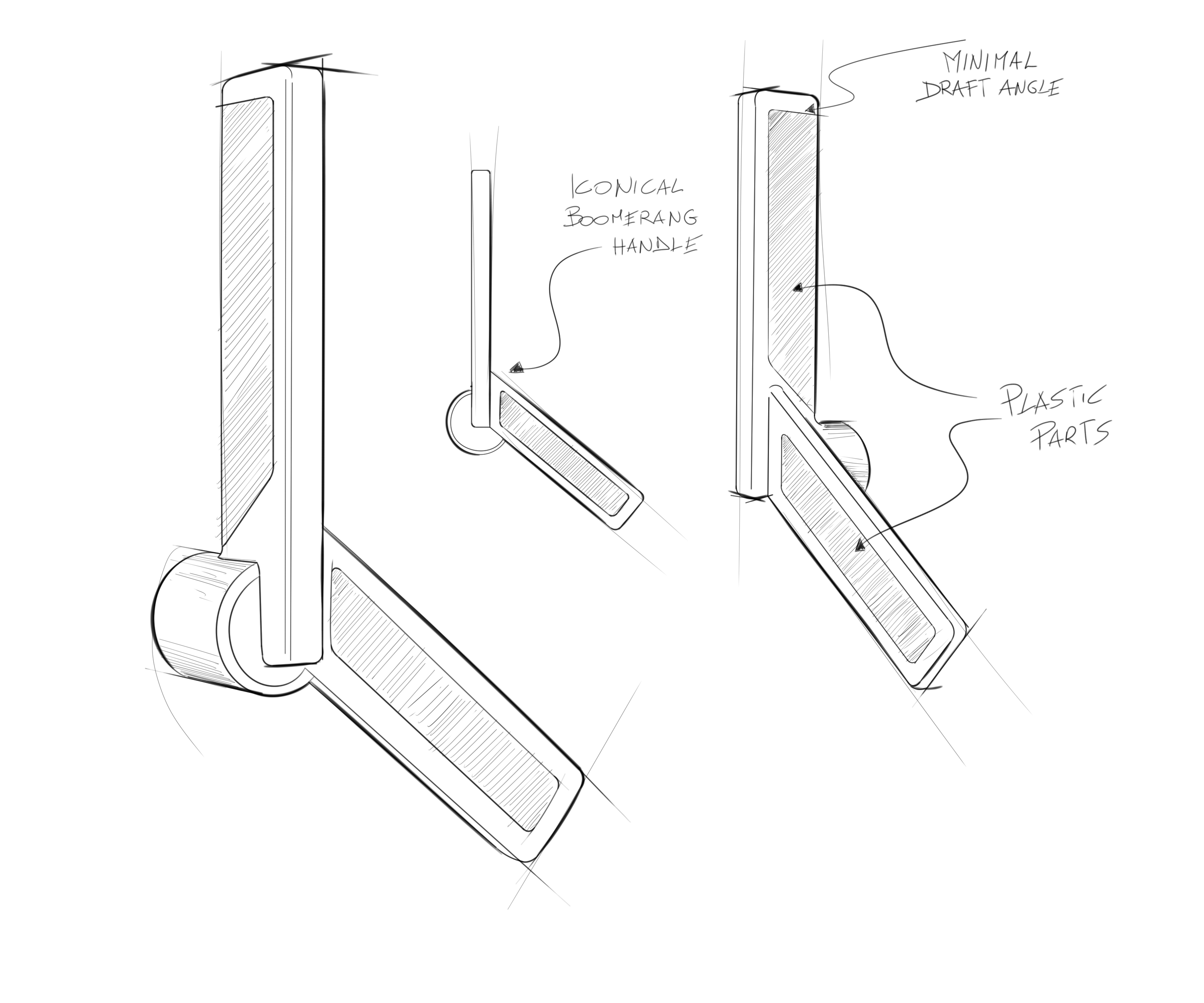
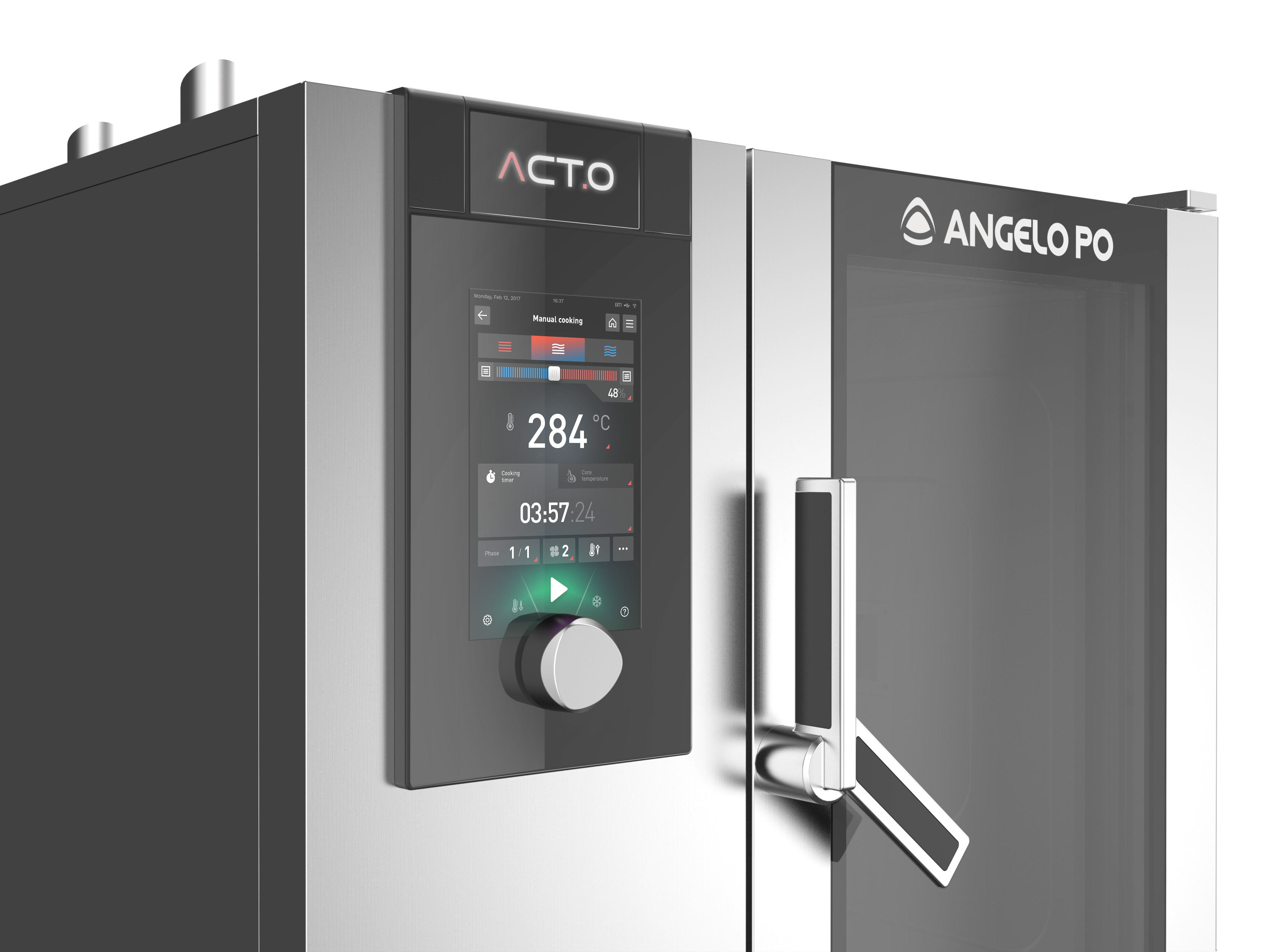
the panel with an interaction knob, the highly innovative boomerang handle, and the Angelo Po logo put in the foreground
ACT.O innovates the design language of the Angelo Po ovens, in order to convey a guarantee of reliability and flawless performance:
square shapes and clean colors, with no stylistic excursions closer to the consumer world make ACT.O an iconic oven that immediately transmits professionalism and solidity.
Moreover, the iconic boomerang handle, designed by Angelo Po to allow the oven to be easily opened even with busy hands, in this new design is conceived in diecasted metal to be more robust and longlasting.
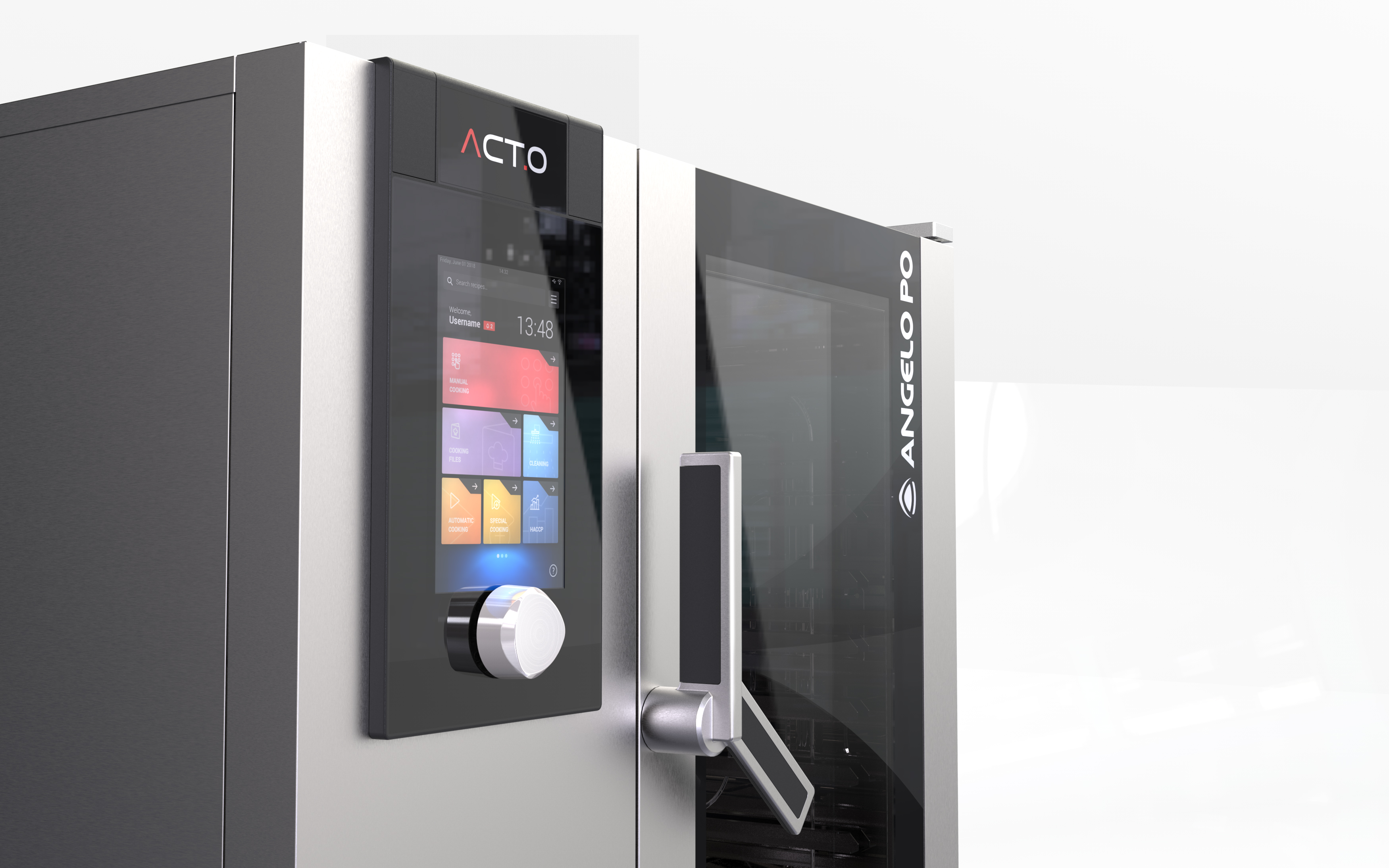
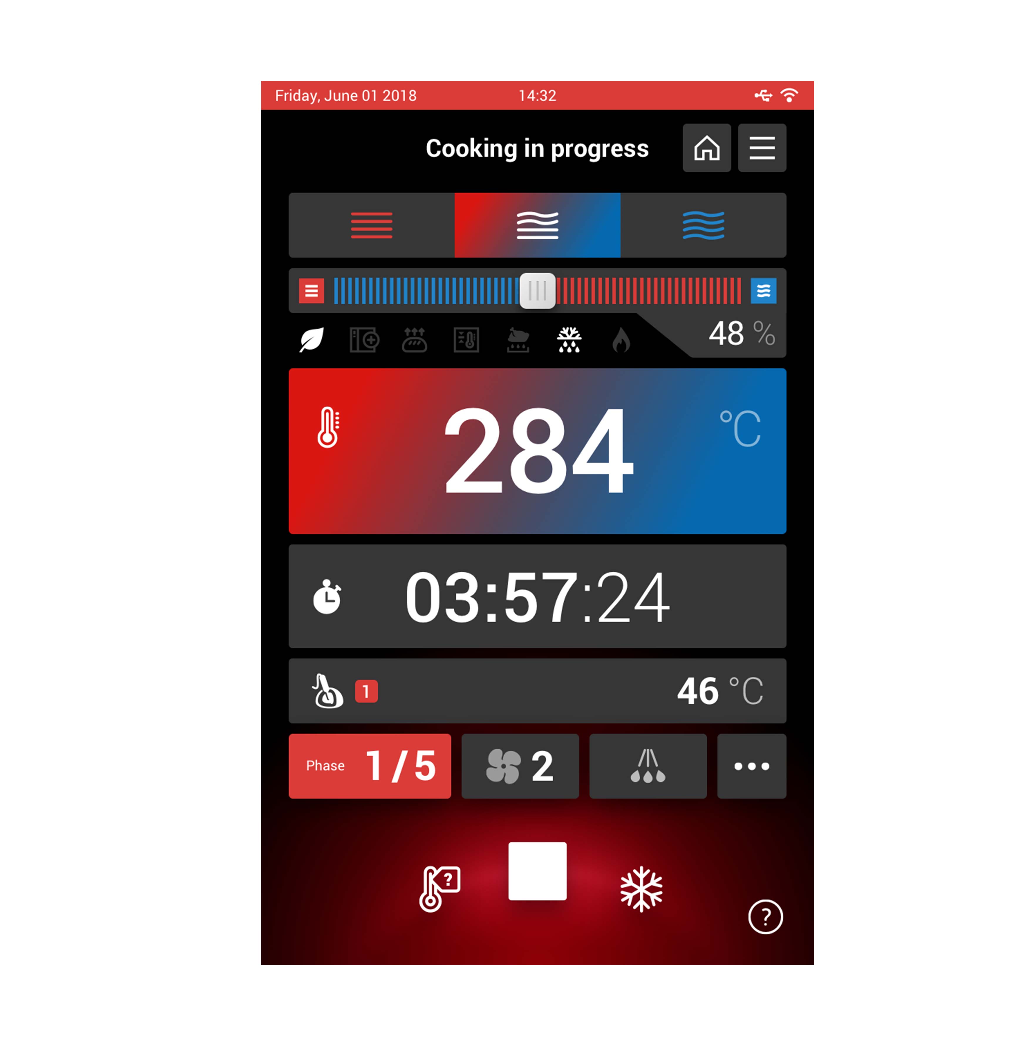
In the new oven we moved the interaction knob very close to the display, to allow the most natural use of the interface. Furthermore, the display is the first 10” display mounted on an oven, with an incredible advantage during the use in chaotic and fast environments such as a professional kitchen.
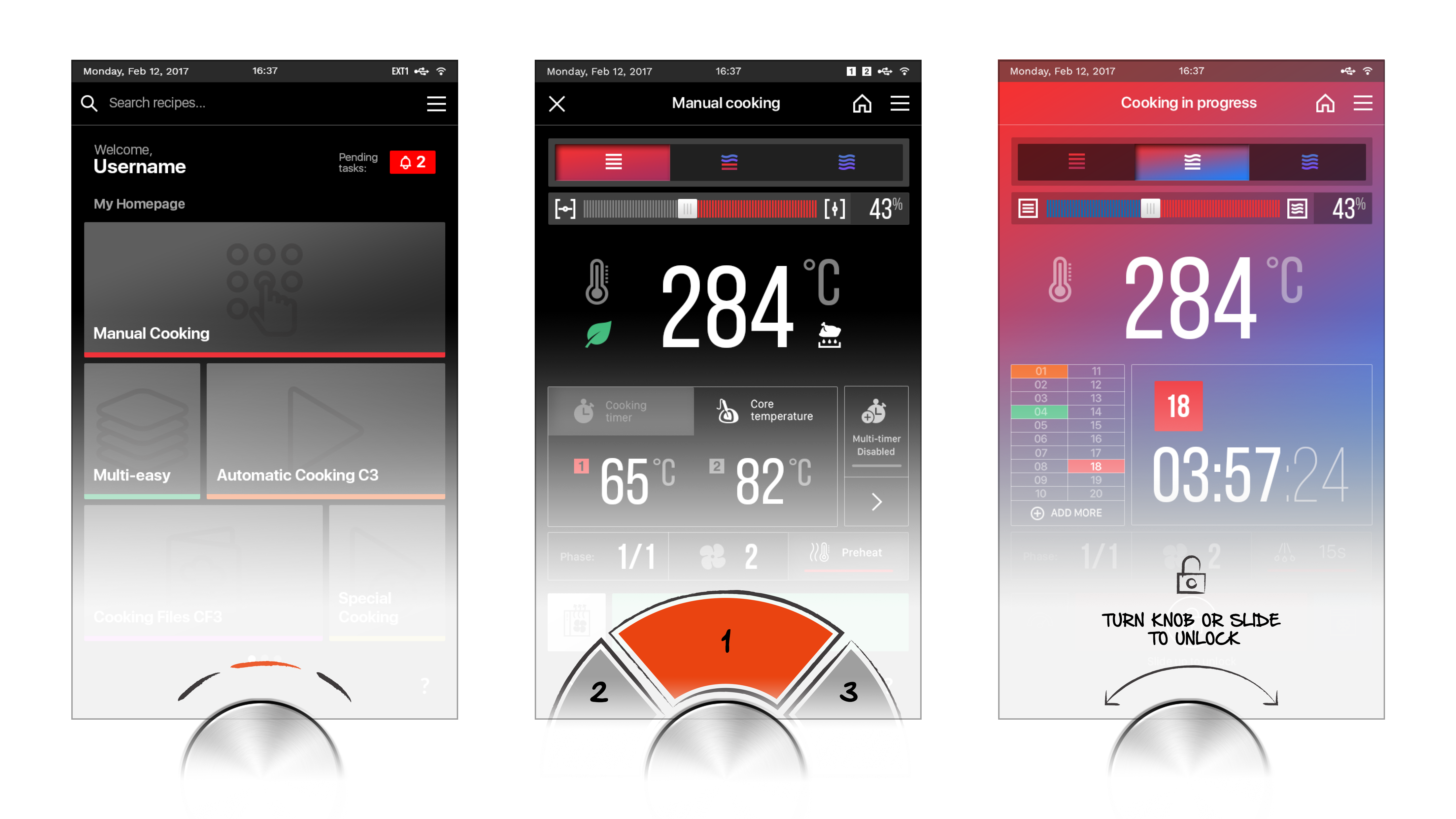
The main aim was to enable non-expert to learn how to use the product. Thanks to a less complex UI and navigation patterns that mimic current behavior like navigation through mobile apps, it was possible to reduce the occurrence of errors during the use, obtaining as a result a faster learning curve for beginners.
An heavy job was done on the display panel: it is now made of two glasses and a compartment that hides external core probes sockets. The panel has been broken down into two different pieces to allow Angelo Po, if necessary, to customize the logo imprinted on glass and sell the oven as an OEM product without having to change the entire display.
The doors that cover the connection sockets are removable but magnetic: to avoid loss, they can be attached to any surface of the oven.
The entire panel can be removed from the front, which makes maintenance operations much faster, no longer having to move and disassemble the back of the oven and its components in order to repair it.
The result of the project is an oven that maintains the iconic design elements of Angelo Po, but updates its features and technology in an exquisitely user-centered perspective.
UX & UI: the distinctive elements
As a most important part of Interaction Design process, that allowed us to significantly improve overall User Experience, we merged the interaction knob with the display in order to create a single interaction point between the user and machine.
Usability trials, with and without eye tracking, revealed significant cognitive effort reduction applying this solution from interaction and ergonomic perspective.
On the other hand, accurate Information Architecture and User Experience design simplified existing interface logics and navigation patterns giving us a possibility to preserve recognisability of each specific function already known to existing users.
Preserving these schemes guaranty fast adaptability to new User Interface with reduced learning curve for both new and existing users. Maintaining existing mental schemes and behavioural patterns that users already posses from their daily activities, like using their mobile phones and navigating through different apps, makes new user interface to result user friendly and easy to understand since the very first interaction.
From ergonomic point of view new User interface, a part from its important display dimension, which makes it a central part of user-machine interaction and a first element noted, precisely designed and studied touch target areas, allow comfortable clicks minimising error rates during operation in harsh conditions. Clear visual feedback using graphical elements and colour provide clear information about current oven status at every moment of interaction. Graphic user interface reflex the soul of the machine using colours and micro interactions to speak with the users. Minimalist iconography and hight colour contrast assure optimal readability in all conditions, even with strong direct light.
ACT.O won a Red Dot Design Award - Best of the Best 2019.