GOING FRESH: THE IRINOX CASE
Irinox
Developing a new look and an enhanced user experience for professional cooling equipment
With such names as “blast chillers” and “shock freezers”, these indispensable fast-cooling appliances are definitely the heavy artillery of any professional kitchen. These products are not only must-haves, they are mandatory by law, under the strict rules of HACCP for the correct and safe preservation of food. And as one can imagine, competition is fierce on the icy yet hot scene of the pro-kitchen cooling market.
Irinox has been the undisputed star in this niche yet strategic market for some 30 odd years. Its iconic products can be found in the kitchens of many a celebrity chef, and Irinox is a household name in the pastry, ice-cream and catering industries too.
Studio Volpi’s cool assignment
The Irinox recipe to maintaining a leading market position relies on constant investment in innovation and on total dedication to offering best performance and top quality together with the best level of service. A large part of Irinox’s success is due to the experience users have with its products, which are instantly recognisable thanks to a strong visual brand identity. It is precisely around this crucial and very delicate area that Studio Volpi was asked to step in, with a complete re-design of the entire product range, not only to modernise its looks, but also to further elevate user experience through an enhanced and modernised user interface. Finally, the Studio was also asked to design the matching Irinox official booth at Milan’s international 2019 “Host” fair.
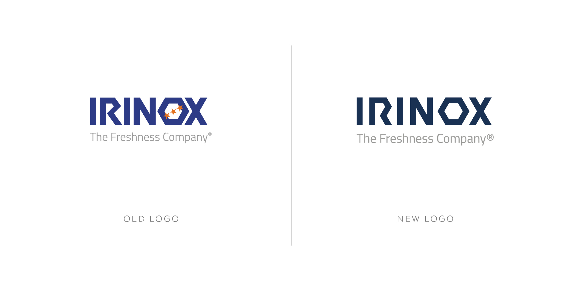
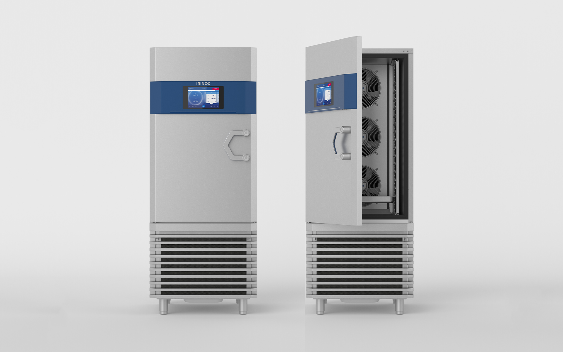
Stainless steel elegance, with a pinch of blue
Changing the looks of a product which design is considered iconic is no simple feat. Rather than a total makeover, it would need to be an evolution of the winning traits of that design, and it started with Studio members joining Irinox people for a 3-day workshop in Conegliano near Treviso, in Northern Italy, where the company is based. The objective was to make sure everybody felt part of the initiative and had a chance to express their views. The process, if it was to stand any chance of success, needed to be collaborative and involve employees, even partners, who felt very strongly about “their” brand.
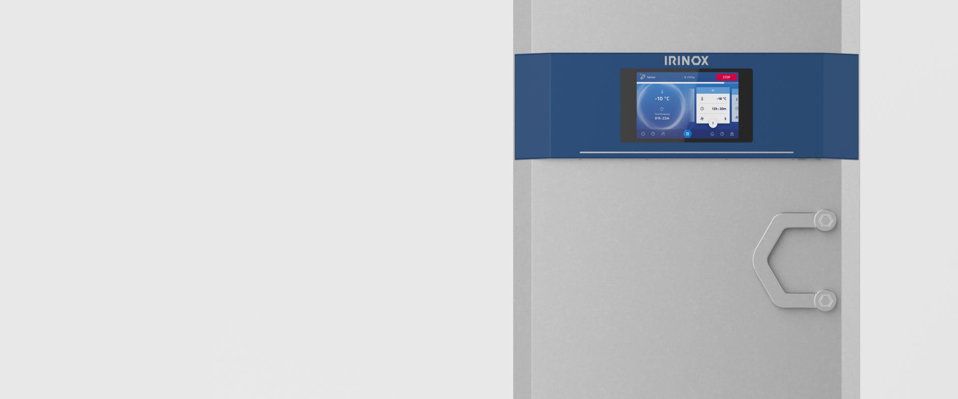
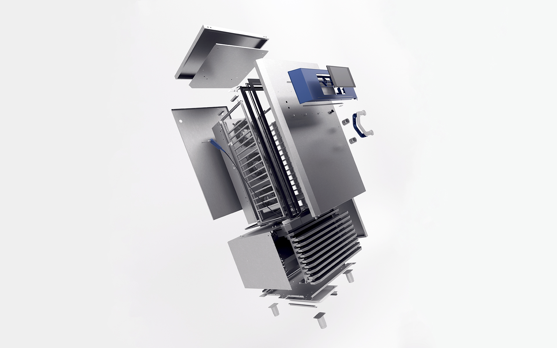
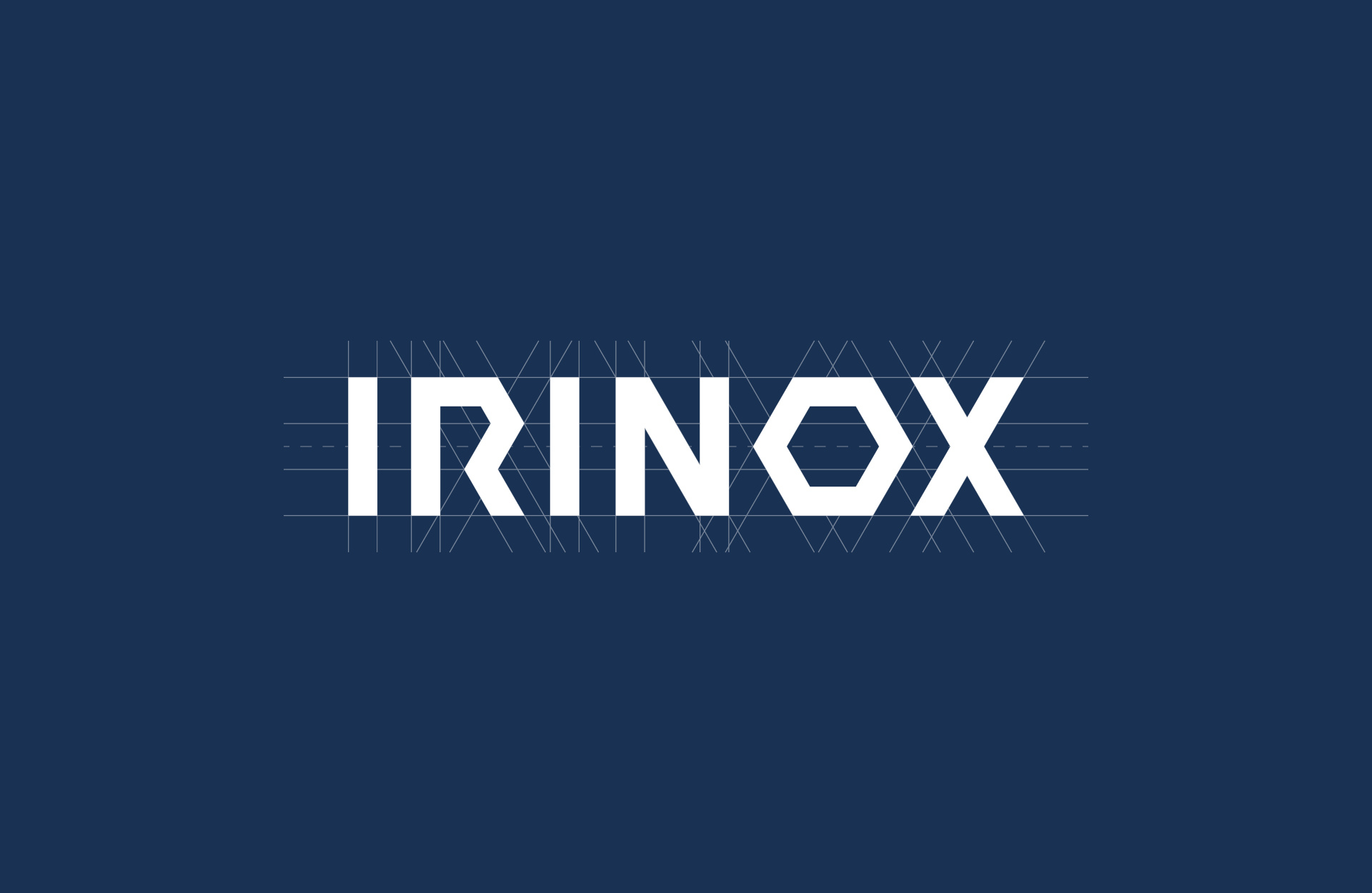
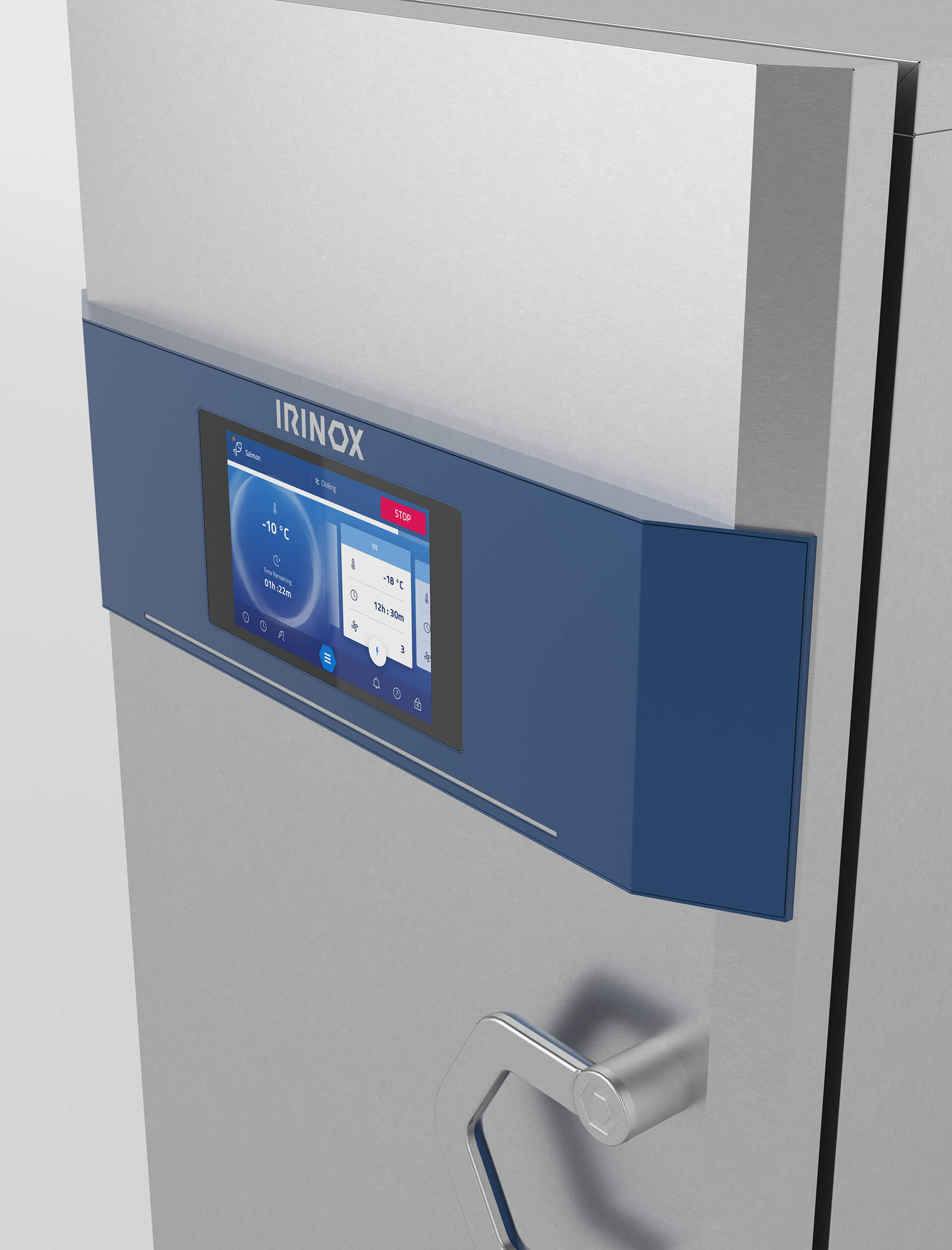
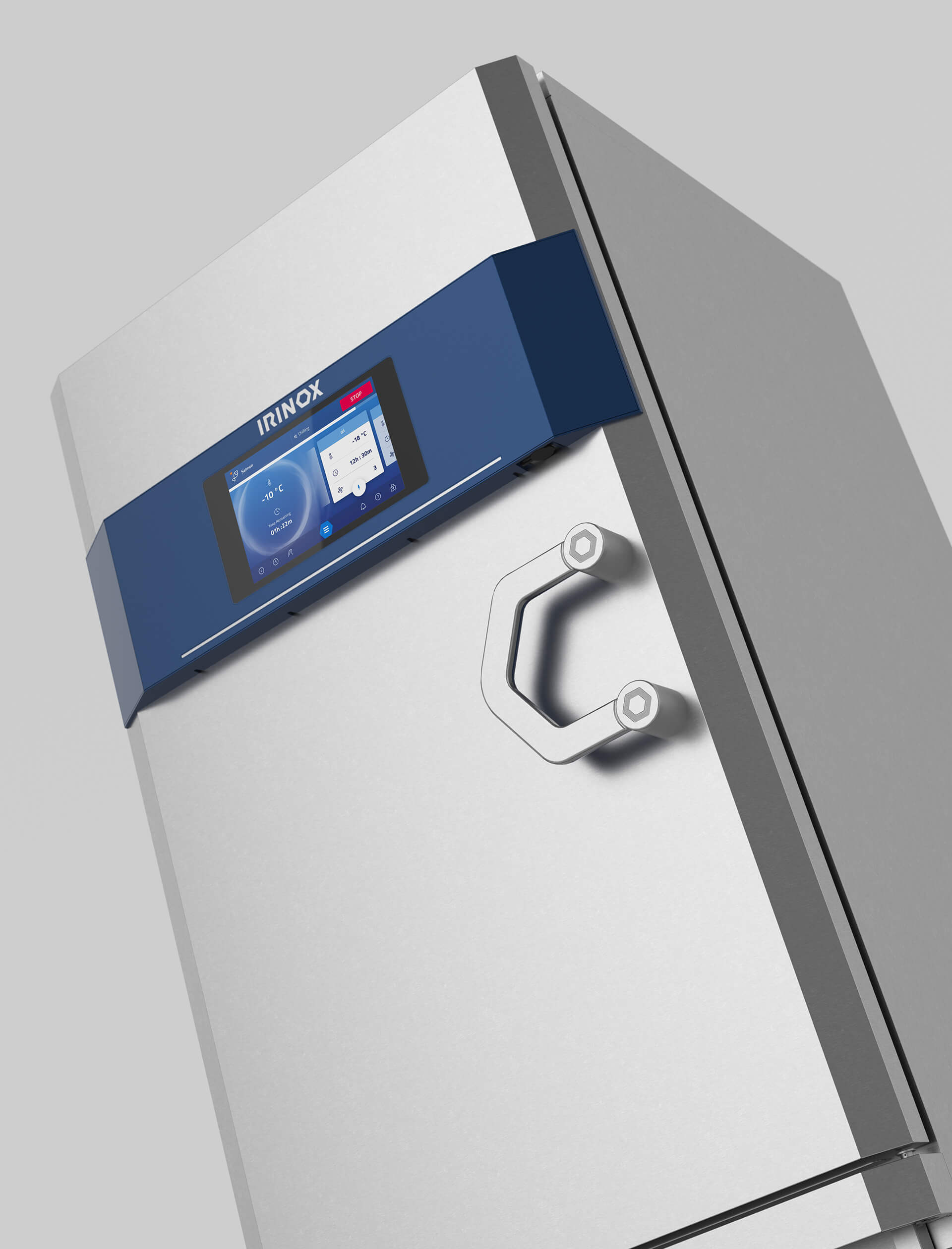
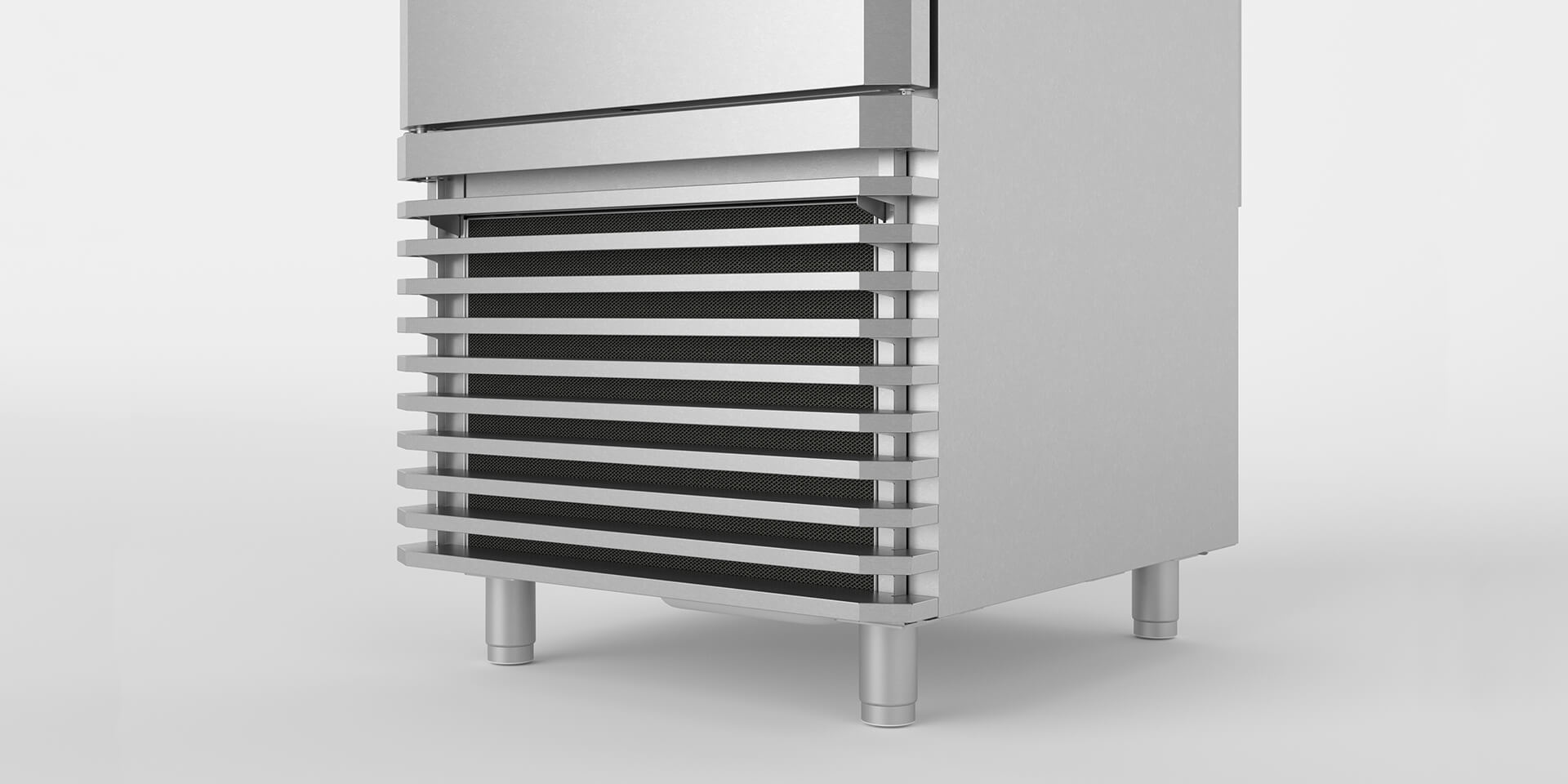
Among the objectives of this approach, the identification of the single aesthetic features that were considered the most defining of the brand. Of course the stainless steel finish, but more precisely, the shape of the handle, the ventilation grid, the blue touches of the detailing, and the special font of the Irinox logo.
Irinox from near and far
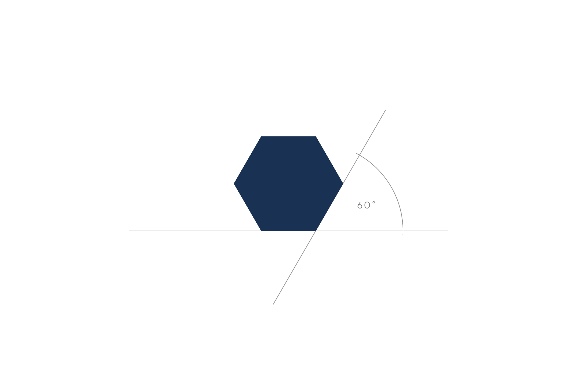
At the Studio we started working on these specific elements with first-glance-recognition of the brand, regardless of the distance from the product, as our principal success indicator.
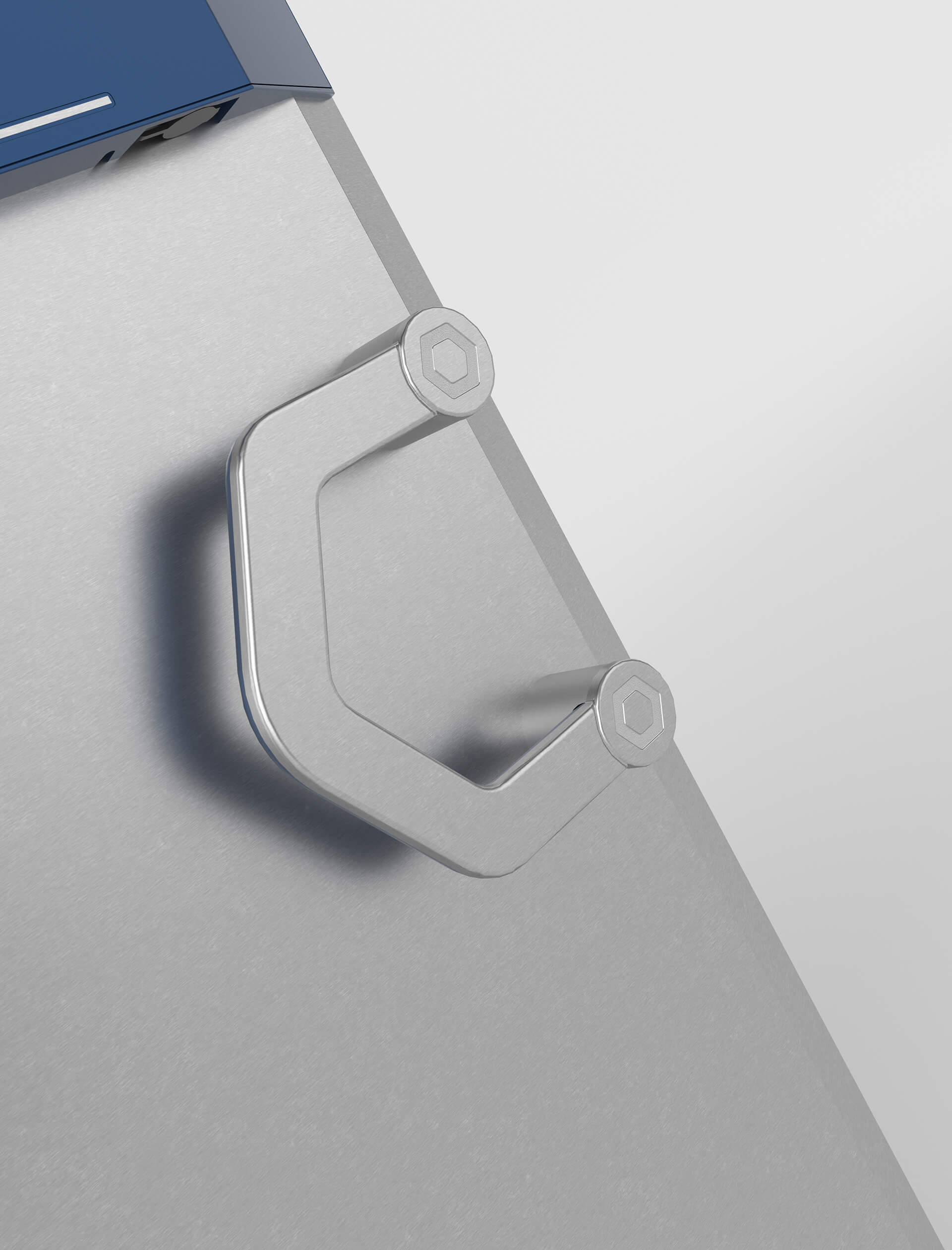
The new handle thus kept its size and position, but the perfect semi-circle had now been replaced by a semi-hexagon evoking the “o” in the Irinox logo, reproducing the same font. The hexagonal “o” was also used as a seal, integrated into the handle.
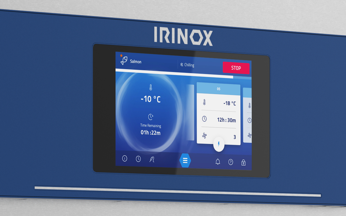
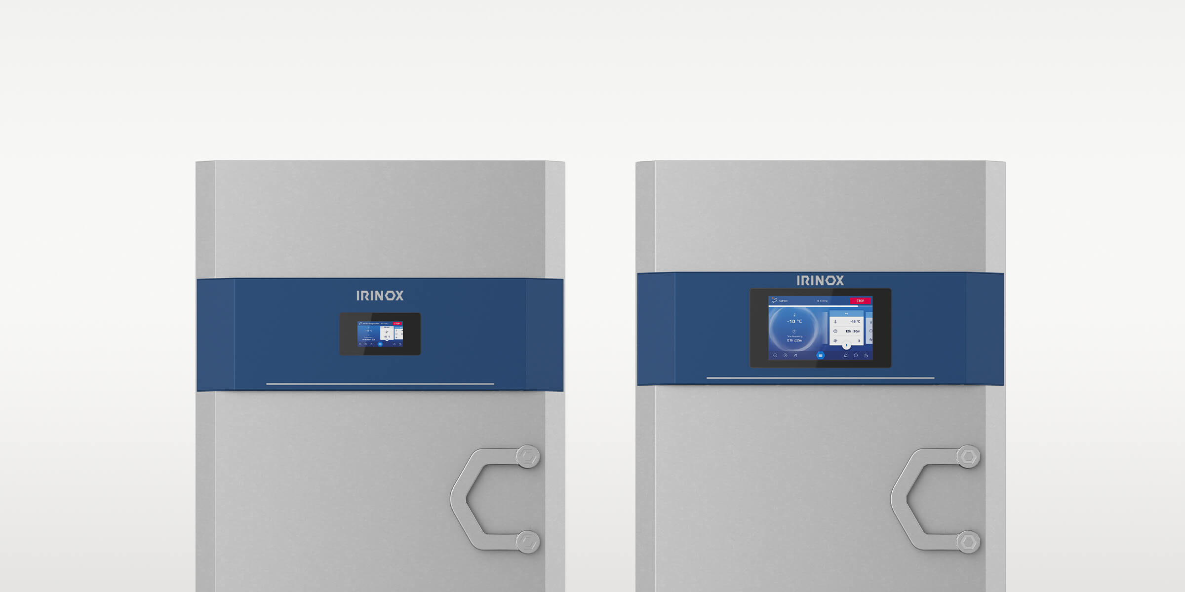
The distinctive blue colour was now to be found in a band running across the top of the appliances, encasing the control panel. A special hue of anodised, metallic blue was created exclusively for Irinox as a strongly characterising element.
The profile of the door, not considered a “protected” identity element, was liberally modified and had now acquired sleek looking and more comfortable chamfered edges.
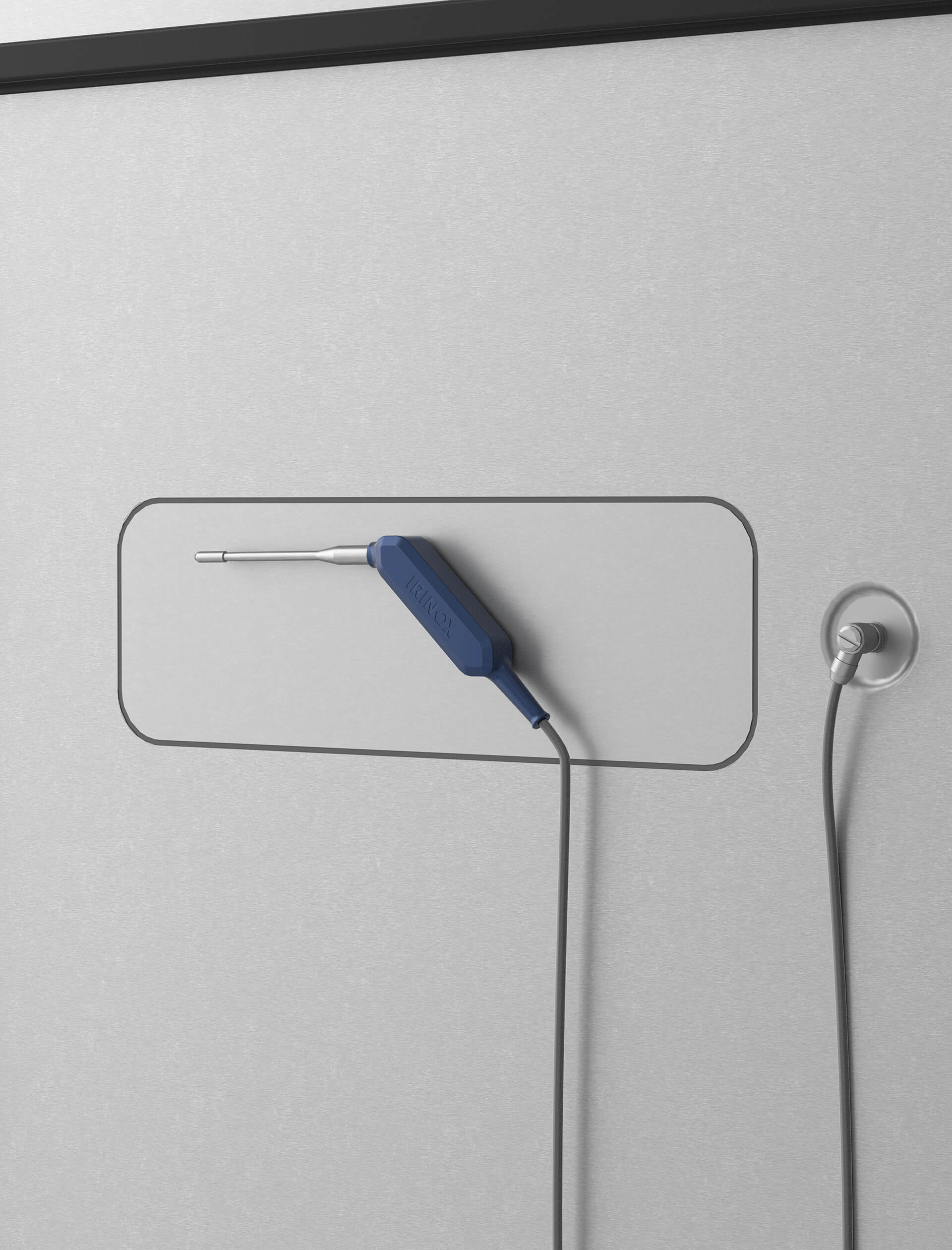
The temperature probe, an essential piece of any blast freezer, was redesigned and given the shape of a hexagon, in line with the logo, the door-handles and the classy seals.
Finally, the air-intake grids were kept almost unchanged to provide a strong déjà-vu effect, an element of continuity with the brand’s tradition.
User experience by design
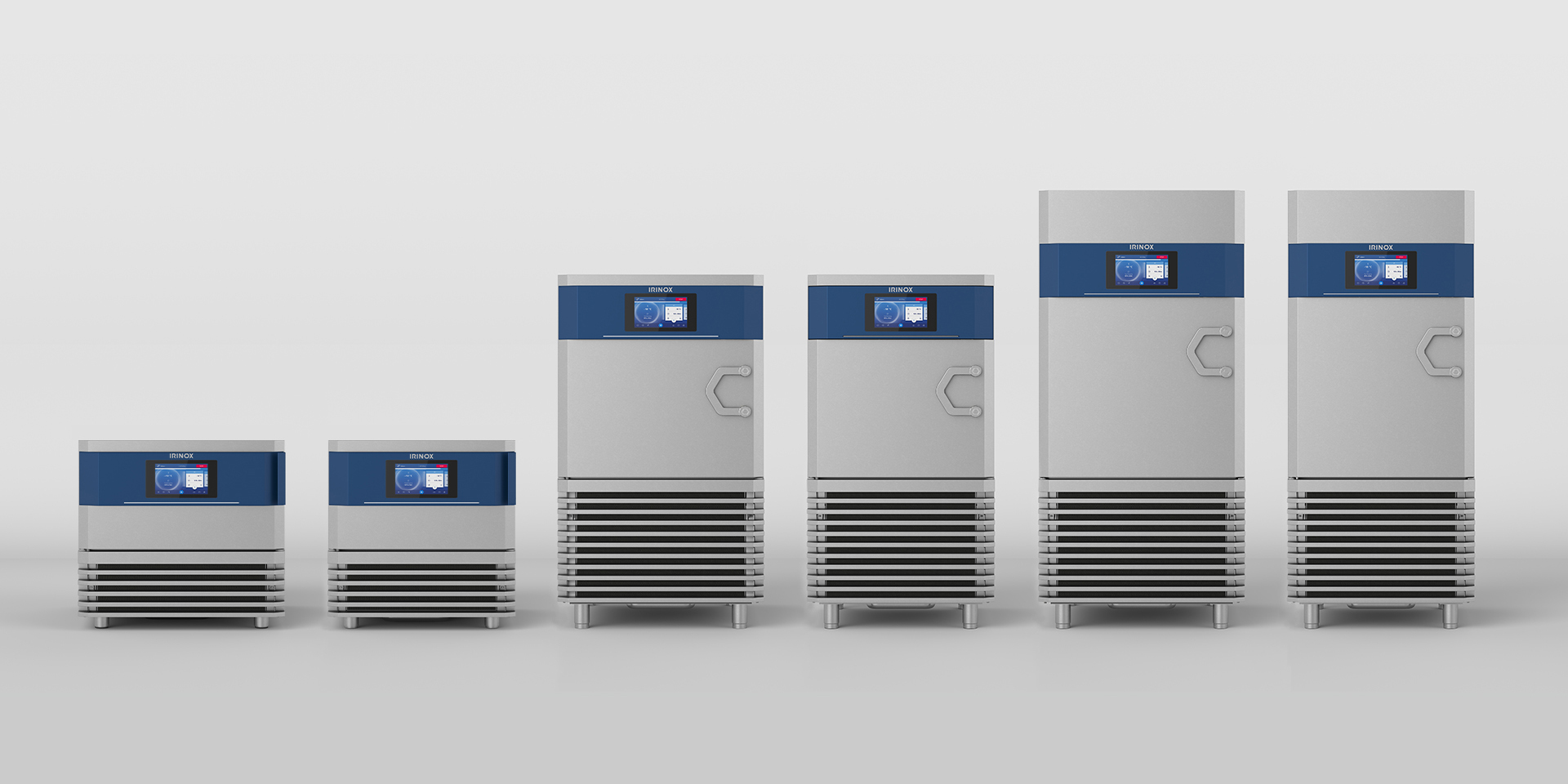
User Interface and User experience, commonly abbreviated in UI and UX, needed a true and meaningful upgrade rather than a simple revamp. To start with they needed to adapt to the fact that the Irinox product range was to shift from the existing 3 families of products with a total of 90 models, to the totally new concept of, substantially, a single model, but entirely modular and customisable.
Customers, depending on their needs and the specificities of their trade, would literally custom-build their own appliances. For this reason, user interfaces needed to be modular, too. We created the Irinox Design System as a way to keep the UI consistent throughout all the iteration by first creating an entire graphical language made of icons, symbols and other elements typically found on screens or commands. This Irinox Design System can be compared to a giant Lego box, from where to fish out any element needed to quickly and consistently compose any possible configuration of the product’s UI.
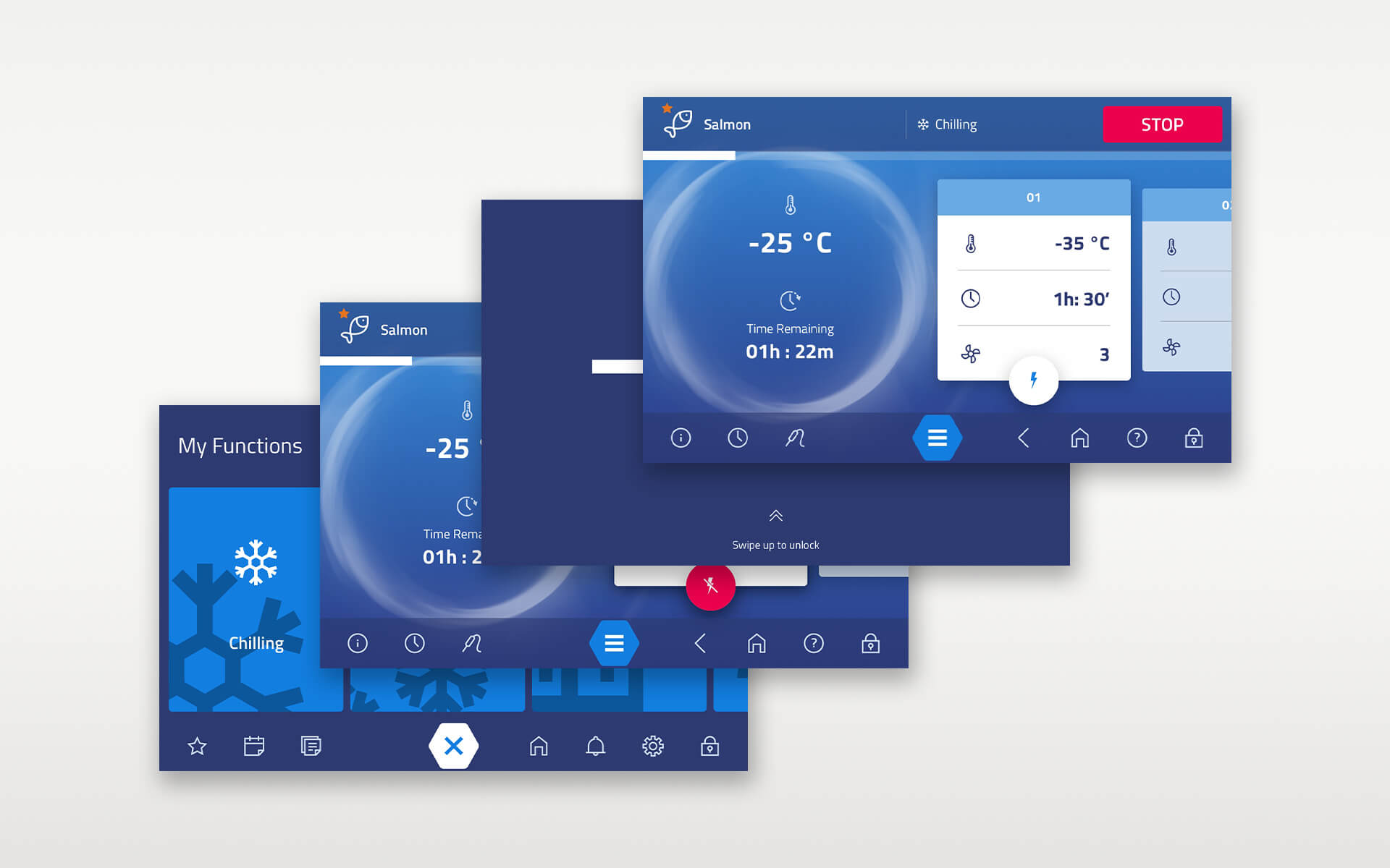
The control was re-positioned in a more user friendly way. We also added another distinctive element, a strip of LED lights right underneath the blue band on the product. A very useful feature when you are working at the other end of your kitchen. The LED strip provides a clearly visible display of the status of the appliance, whether it is idle, working, at which stage it is in the current process, and even whether there is a problem.
These insights came through the involvement of the Irinox network of professionals, cooks, pastry chefs, bakers, and ice-cream producers. Over a 3-months period, the Studio interviewed over 50 of them, collecting precious insiders’ views on user experience and gaining a clear understanding on how to evolve and improve it.
Software was another major focus of our work. IoT is becoming increasingly important in the professional kitchen. Blast chillers are no exception, especially since they are moving to center stage in the modern day catering industry. Processes can be stored in the Cloud and sent to any appliance anywhere. Dedicated connectivity portals can also track all the different appliances in a kitchen, from the blast chiller to the oven, to the dishwasher, on the same platform.
Compliance with current laws and food safety norms was also an important part of the job, especially for what concerns HACCP rules. For instance, among the many functionalities, the new interfaces can easily print all the necessary labels to be put on trays or individual food items for storage.
Ice transparencies at Milan’s Host fair
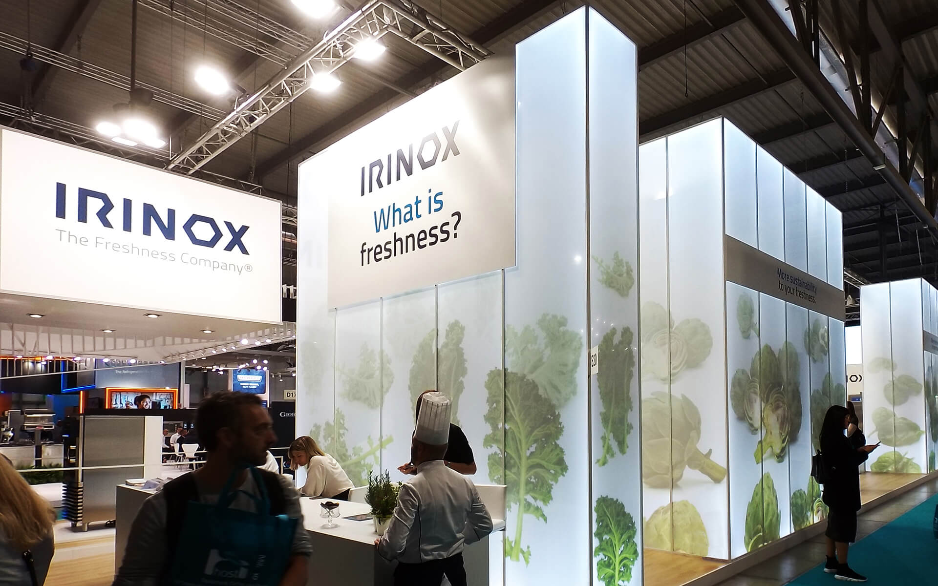
The Studio also had the privilege of creating the concept of the booth that was to host the new “collection” of Irinox star products. The venue was Milan’s International Host fair, 2019.
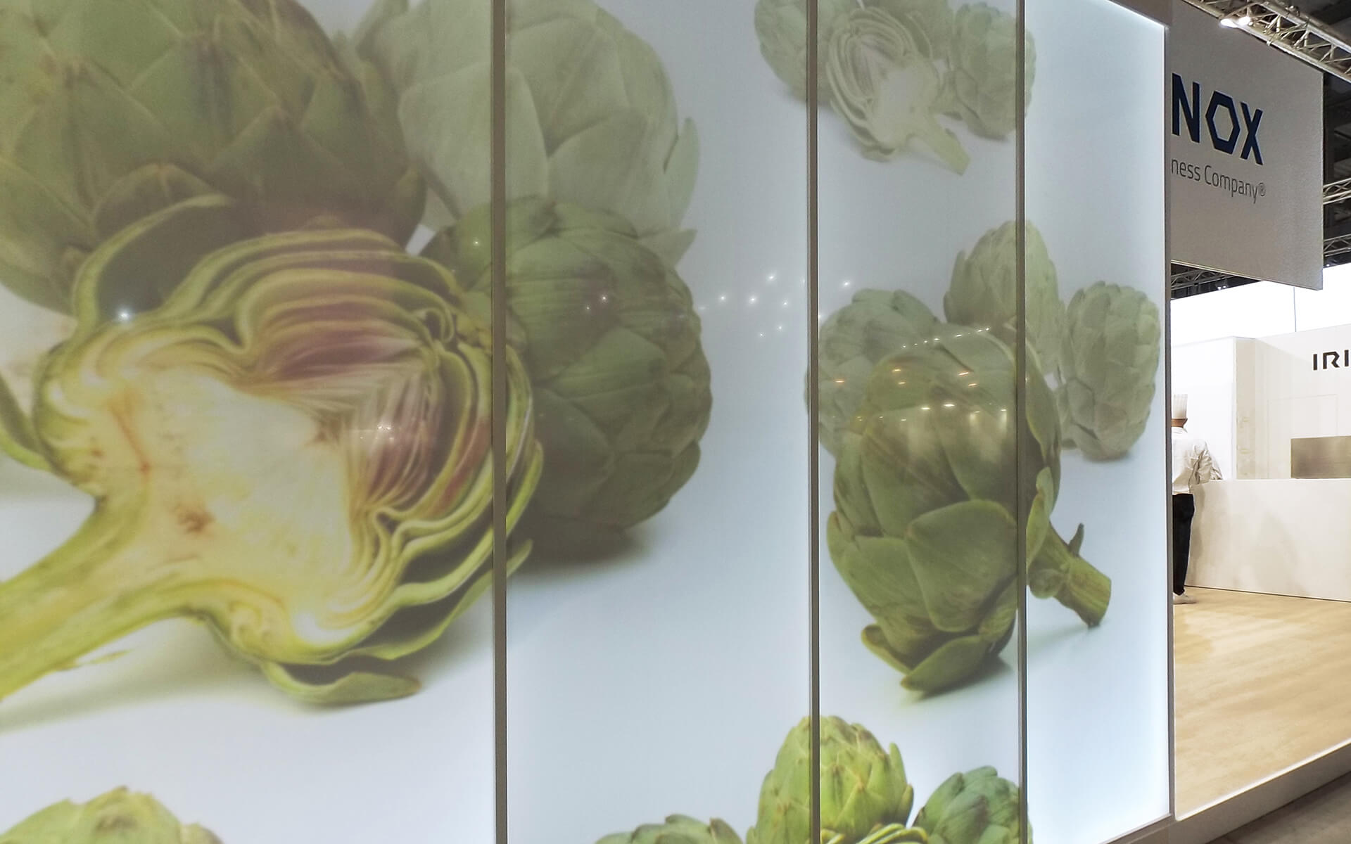
The idea was to concentrate on the principal benefit of the products: perfect preservation of food. The best way to represent this concept was by showing fresh produce, mainly greens, encased into transparent ice.
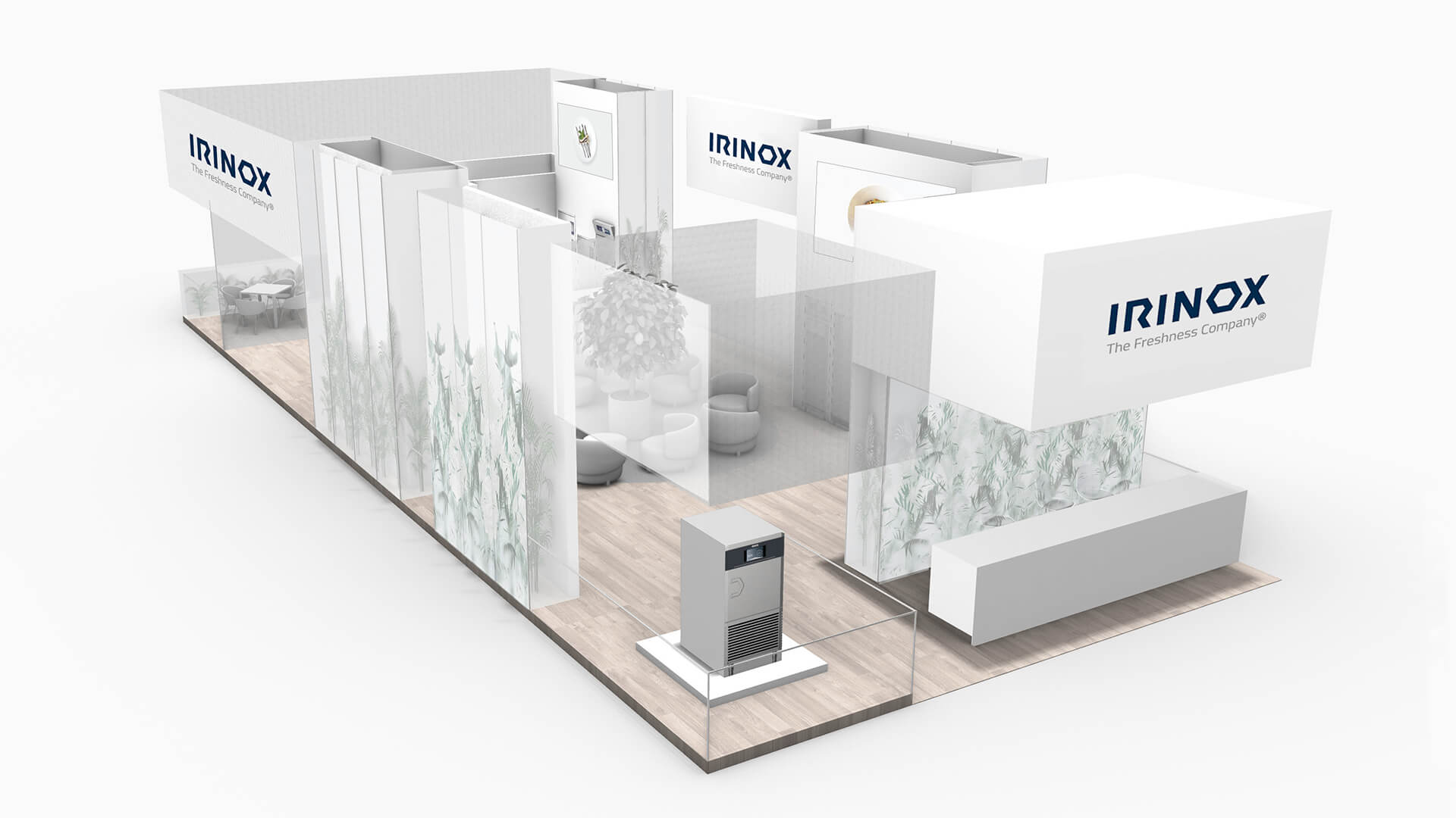
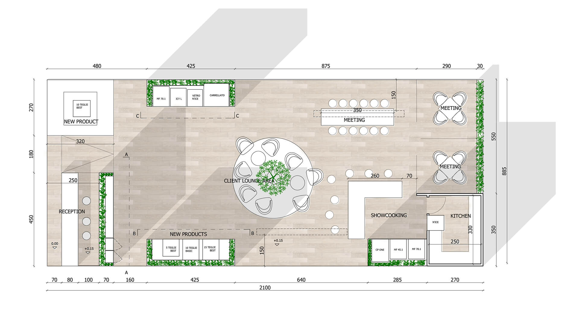
The walls of the booth consisted in semi transparent “ice” panels, showing the beautiful vegetables inside. The panels were made of plexiglass and retro-lit to create a transparent-ice effect. The floor, as a contrast, was made of clear wood, another natural element, to express warmth. Both the old and the new collections were to be on display, so specific areas were created, with the place d’honneur being reserved to the new star model, on a platform right at the entrance of the booth, next to the reception desk.
The design was completed by two office areas, a central lounge defined by a warm, round carpet, and a kitchen also used for show cooking events.
Latest trends and Studio Volpi’s human approach
Nowadays, the most innovative pastry and kitchen chefs have taken to using their blast chillers creatively as part of the production process, rather than relegating them to simply preserving their works of art or their ingredients. Also, the latest industry trends see these products now offering one additional feature you’d never expect to find in a cooling appliance: perfect heating, or rather re-heating of food that was previously speed chilled or even frozen, back to fragrant, fresh-tasting specialties. In other words, the blast chiller is definitely on the rise as the technological hero of modern era gastronomy.
This project was all in all quite complex, as it implied the deployment of multiple competencies over an extended period of time. The task was to provide some very technical solutions, that also had important emotional and visual elements to them. These had direct, substantial commercial implications for the customer. Not a small responsibility. The Studio’s approach, taking a human perspective on the task and involving people in the first place, was instrumental in finding the right solutions. New, at times unexpected, and always highly creative.