-
È LA VITA CHE TI PORTA
Dierre
View Case StudyStudio Volpi signs the new communication campaign for Dierre.
Dierre, an Italian brand leader in innovation in the sectors of armored doors, internal doors and security closures, founded in 1975 by Alessandro and Vincenzo De Robertis, was looking for a creative agency that could give new life to its brand.

-
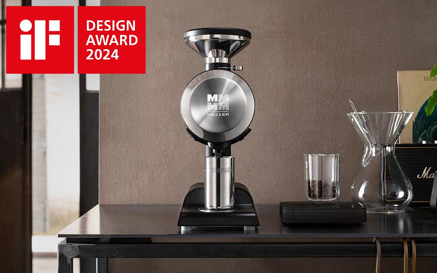
DESIGNING THE PERFECT GRIND
Mazzer
View Case StudyPhilos by MAZZER is one of Studio Volpi’s latest design projects in the field of high-end equipment for the balmy world of coffee.
-

CLEAN DESIGN FOR CLEANER AIR
View Case StudyStudio Volpi designed the hardware, the software and the entire user experience of Teqqo’s ultimate air purifier
-
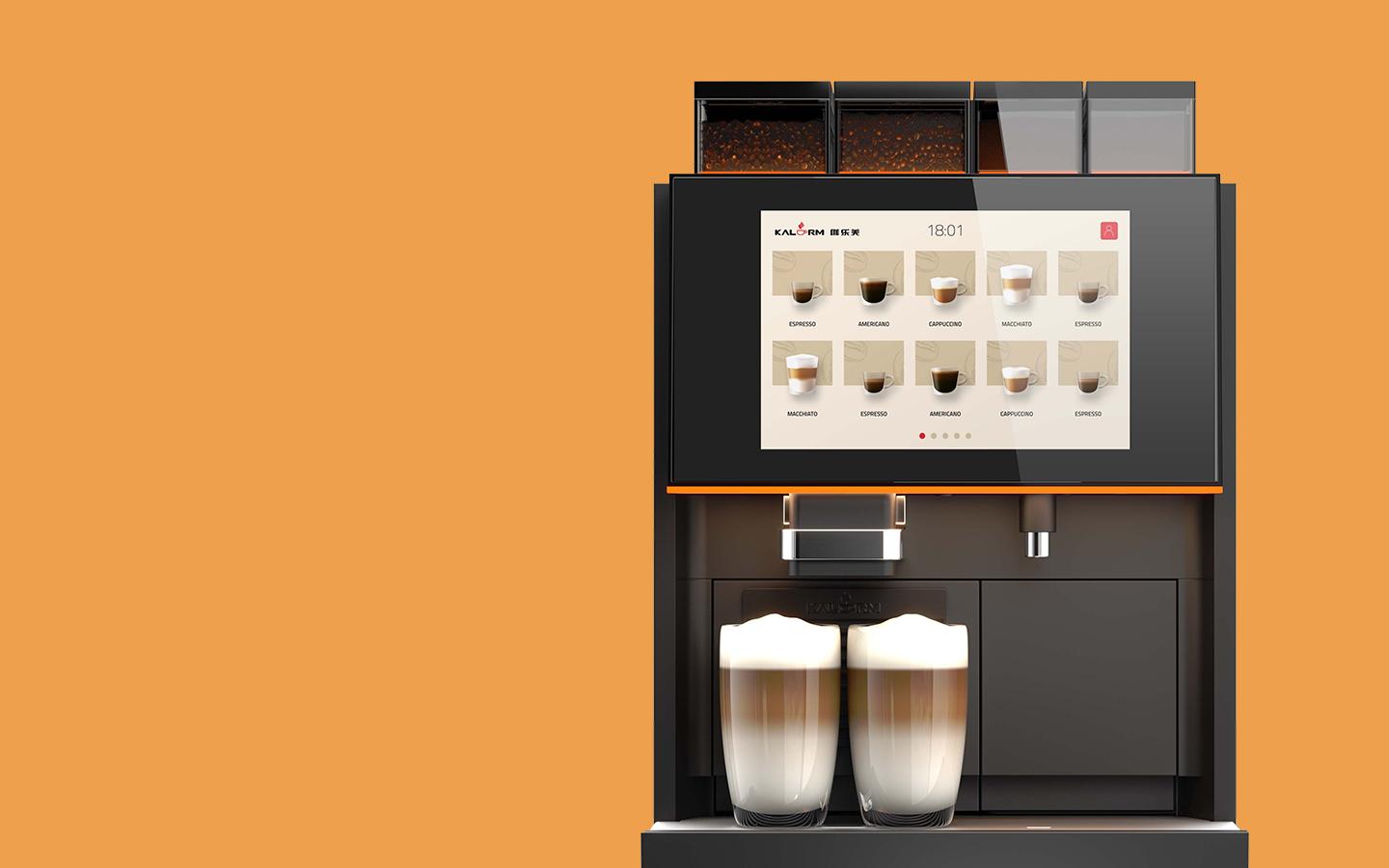
DESIGNING THE TRUE BARISTA EXPERIENCE
View Case StudyHow Studio Volpi created the perfect multi-user experience for a leading coffee-machine manufacturer
-
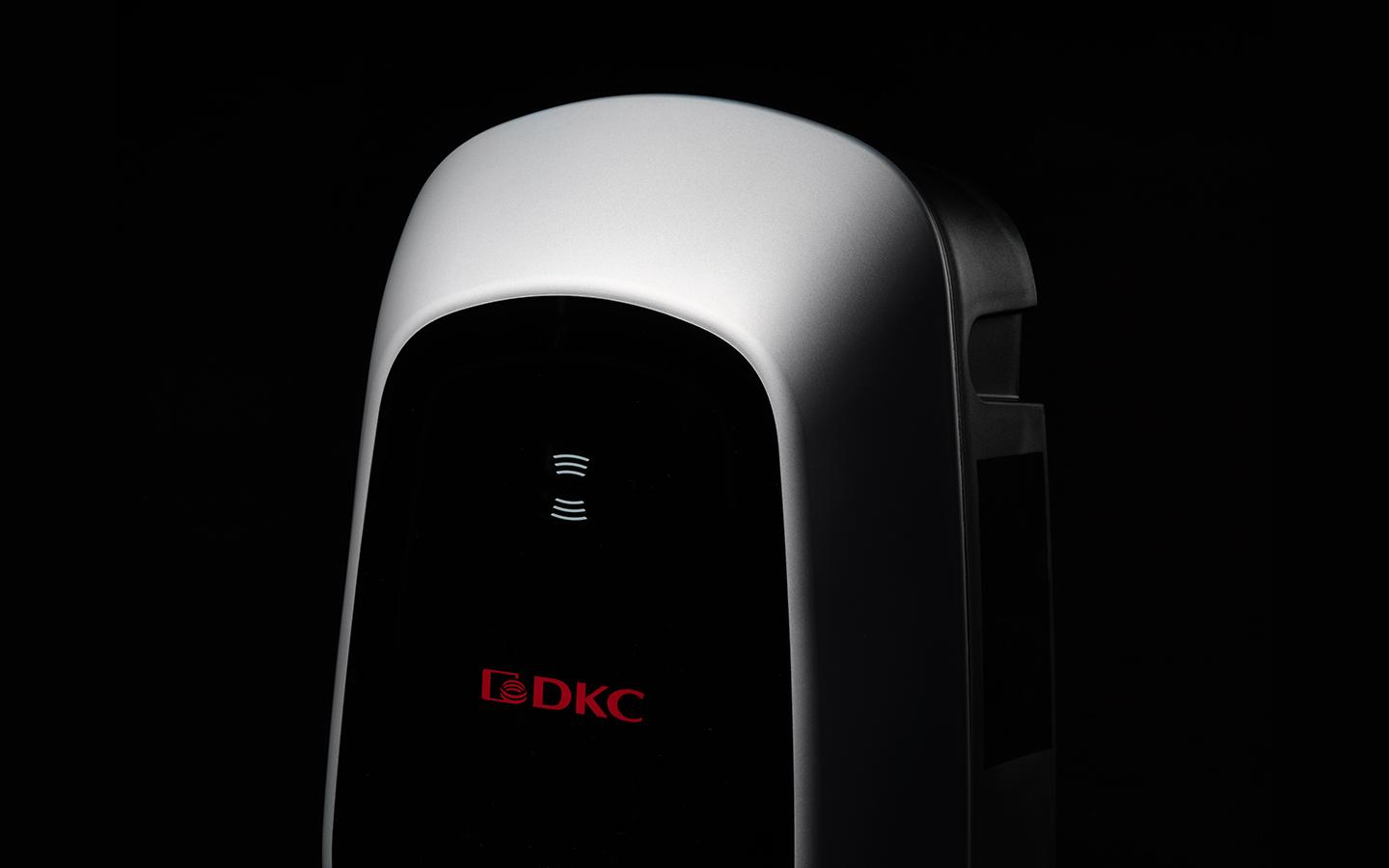
FUELLING TOMORROW’S SUSTAINABLE MOBILITY
View Case StudyStudio Volpi designed DKC’s next generation e-charger
-
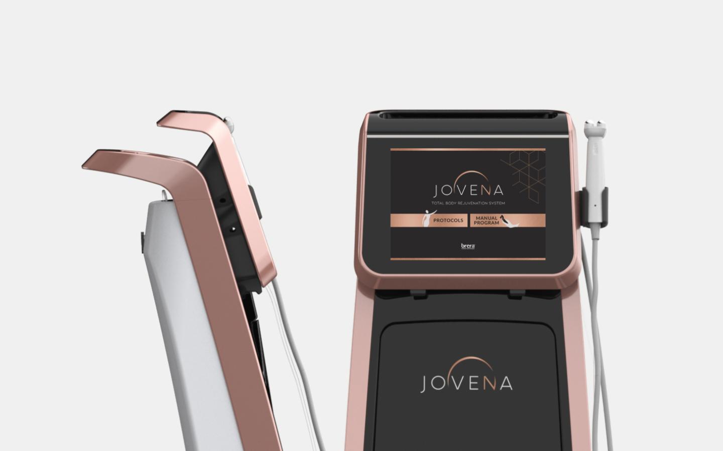
WHEN BEAUTY MEETS MEDICAL TECHNOLOGY
View Case StudyStudio Volpi recently helped leading med-tech producer Brera with the design makeover of one of its star products.
-
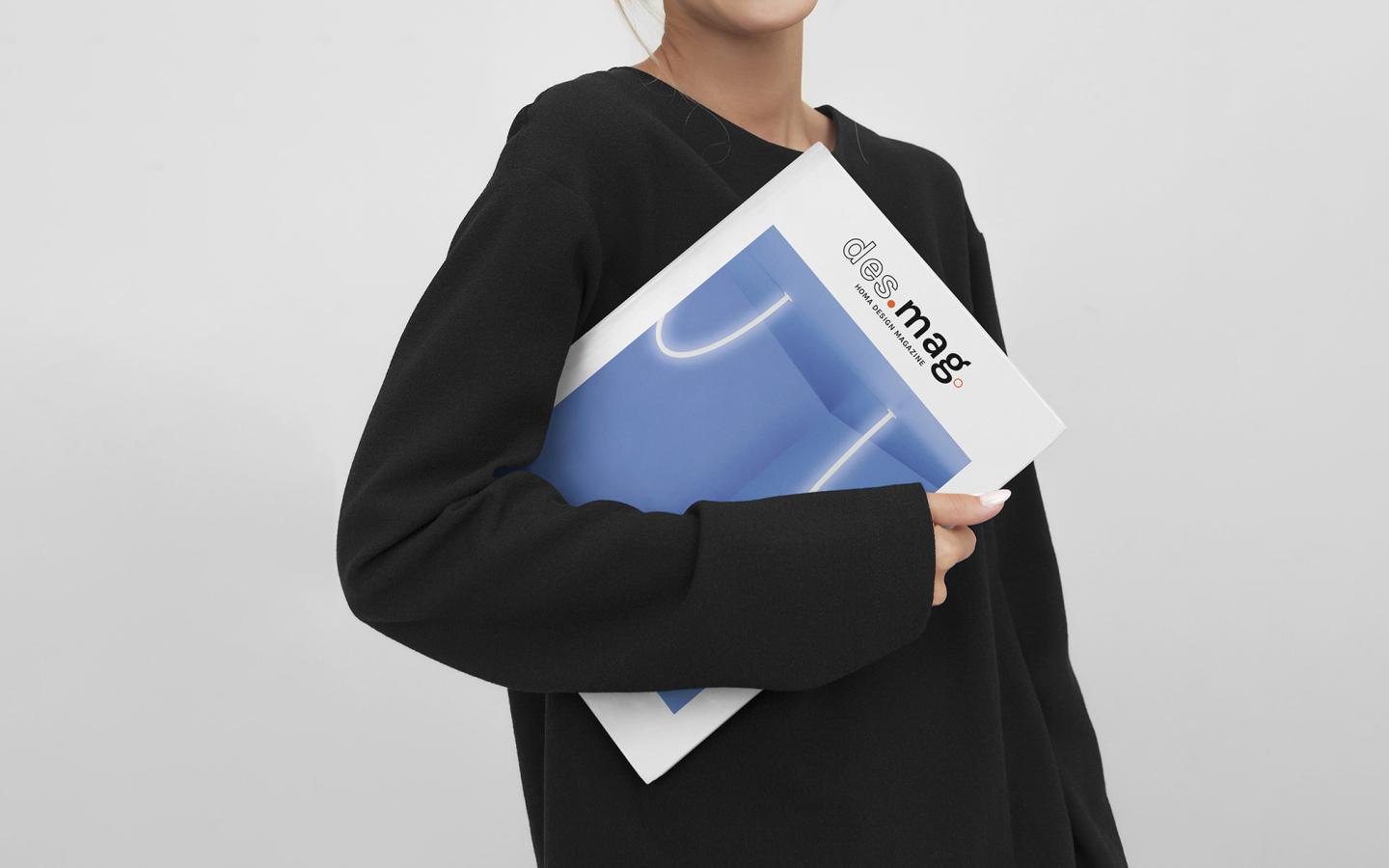
DESIGN COOL
Homa
View Case StudyHow Studio Volpi supported China’s leading refrigerator exporter in a new editorial venture, a Design Magazine with real journalistic content, thought provoking insights and inspiring interviews, for the eyes of its multinational clients.
-
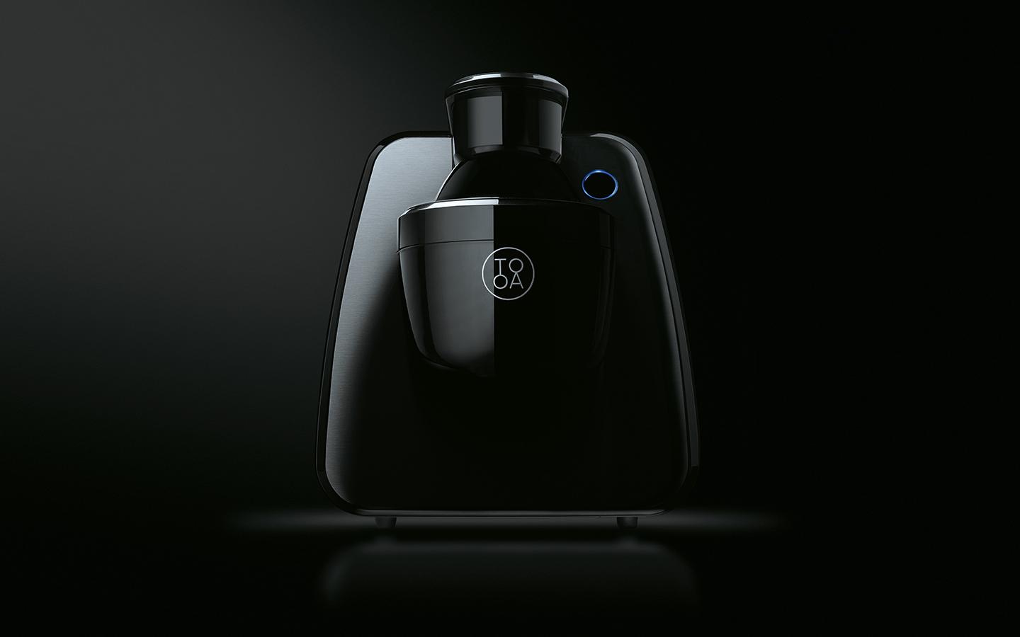
TOOA: THE MACHINE THAT CHANGED THE WAY TO ENJOY GELATO AT HOME
View Case StudyHow Studio Volpi helped design, engineer and market a ground-breaking counter-top “gelato” machine.
-
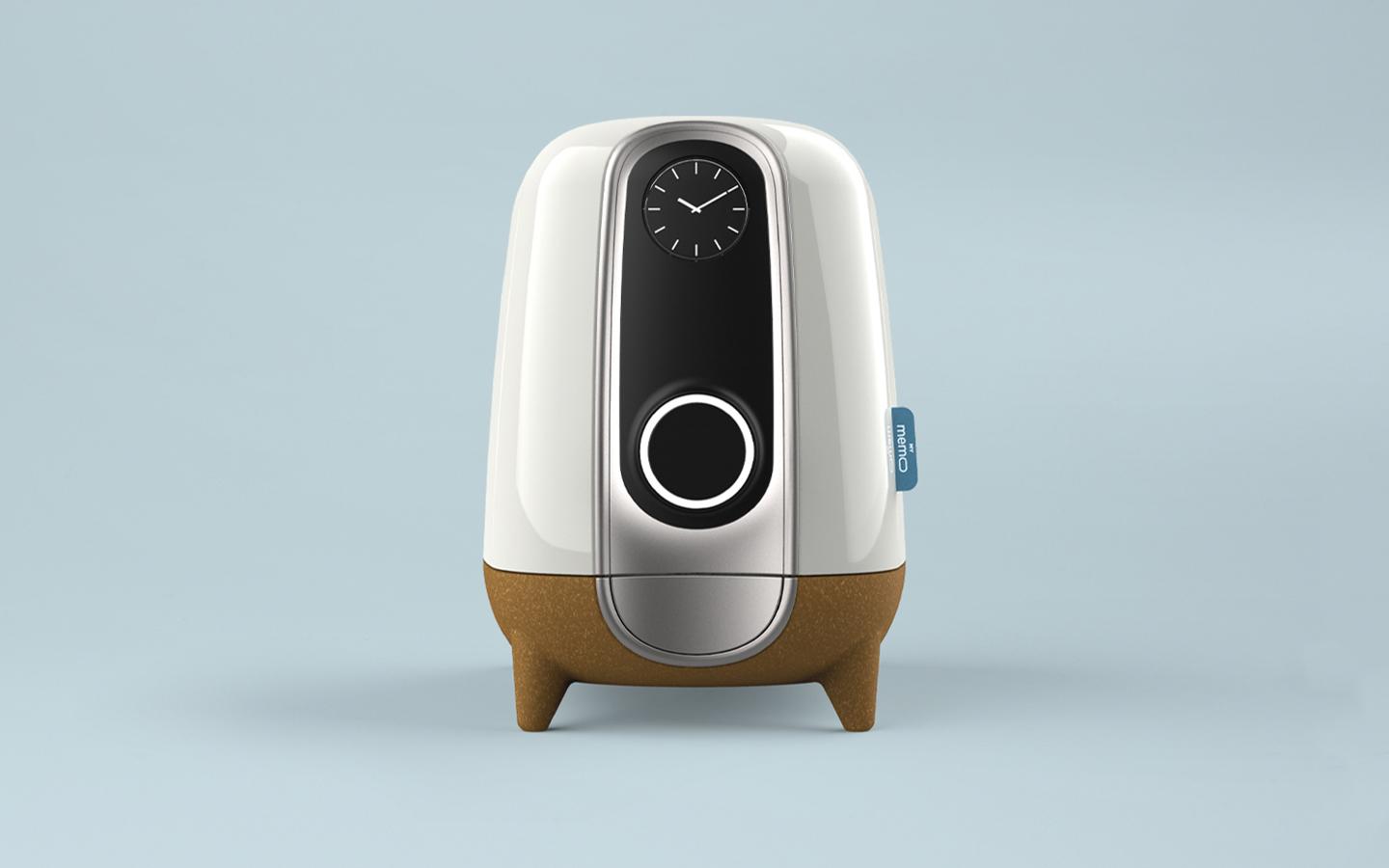
Mymemo: Design meets precision engineering to deliver... pills!
RGF Diagnostics
View Case StudyTwo doctors asked Studio Volpi for a device helping their anti-coagulated patients adhere to their daily therapy. The result was a cute looking counter-top appliance that actually helps saving lives.
-
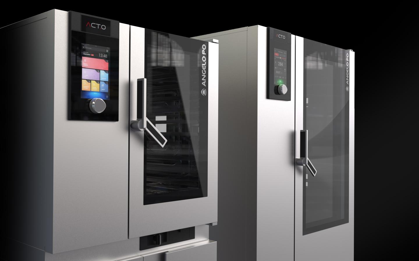
Enabling a memorable cooking experience
Angelo Po
ACT.O professional combi oven
View Case StudyACT.O by Angelo Po is the new standard for combined ovens: a complete professional catering equipment but, above all, a multimedia platform dedicated to the optimization of resources and maximum efficiency thanks to an innovative UI that led ACT.O being Best of the Best at the Red Dot Design Award
-
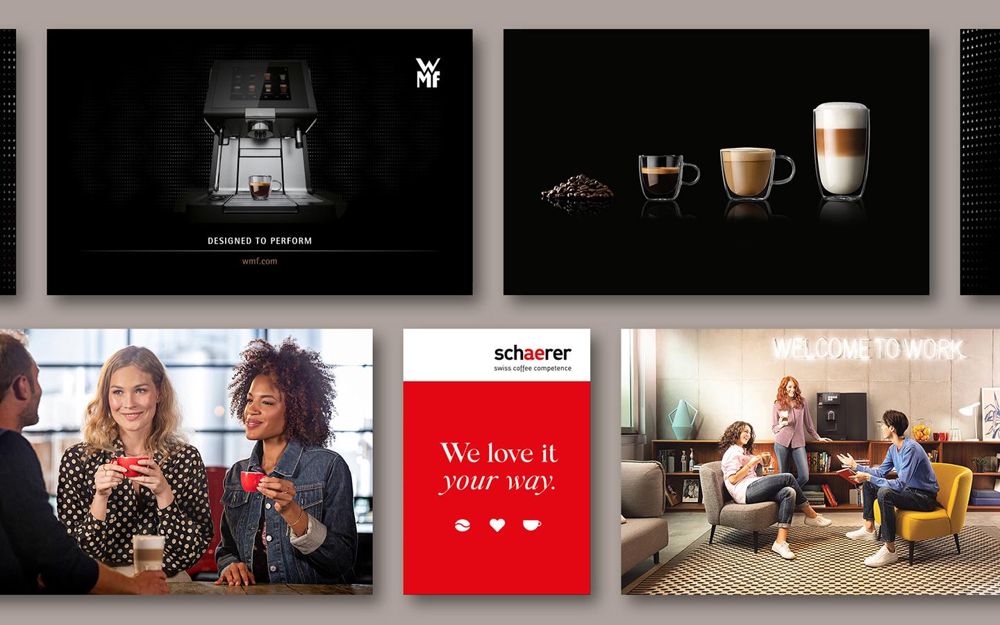
A multifaceted branding path WMF Group
WMF
Schaerer Professional Coffee Machines Branding
View Case StudyDuring the years our partnership with the Professional Coffee Machines brands WMF and Schaerer touched upon our competences in Branding, Digital and Design.
-
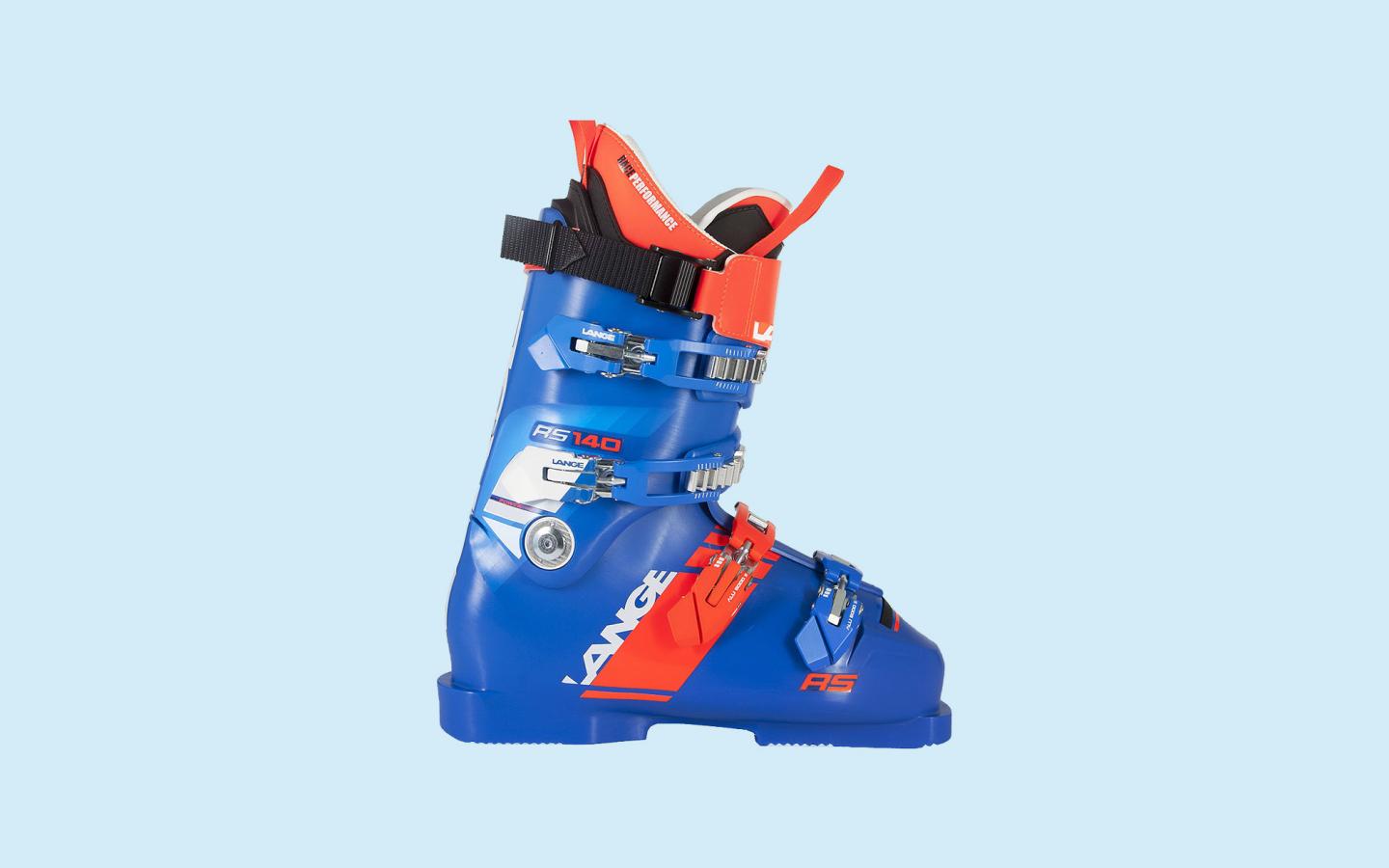
Enhancing ski boots performances
Lange
2018 RS & RX LINE
View Case StudyThe strength of the Lange brand and the skills of our designers came together in the complete restyling of the racing boot series: RS, RX and SX. We improved both the shape and the appearance, without penalizing the recognition of the brand.
-

-
Winner 2021
-
-
Smart Baby Carrier R041
Baby First
Winner 2020
-
-
-
Angelo Po - ACT.O Oven (Best of the best)
Angelo Po
-
A breath of fresh style
Boneco
Winner 2019
-
-
Winner 2018
-
Winner 2012
-
Winner 2009
-
-

-
Winner 2020
-
-
Nota Nota
EBRAM
Winner 2018
-
-
-
-
-
Skido High Chair
Baby First
Winner 2018
-
-
-
CORINTHIA
FABER
-
Brand identity
HUB Parking Technology
-
TOWER
FABER
Winner 2016
-
-
-
Hi5 & The One
Friulinox
Winner 2015
-
-
-
Baby car seat - R101
Baby First
-
Baby car seat - R102
Baby First
-
Baby car seat - R502
Baby First
Winner 2014
-
-
-
Brand identity
Baby First
-
Graziella bicycle
Bottecchia
-
Brand identity
HUB Parking Technology
-
Naboo
Lainox
Winner 2013
-
-
Winner 2012
-
Winner 2011
-
Winner 2010
-
Winner 2009
-
-
-
-
Rotograph Prime
Villa Sistemi Medicali
Winner 2016
-
-
-
Naboo
Lainox
Winner 2015
-
-
Winner 2014
-
Winner 2012
-
Winner 2008
-
-
-
-
Rotograph Prime
Villa Sistemi Medicali
Winner 2015
-
-
-

-
-
Kos TVM
Sigma
Winner 2019
-
-
-
-
Winner 2015
-
-
Baby Car Seat - R101
Baby First
Winner 2014
-
-
-
Brand identity
Baby First
Winner 2013
-
-